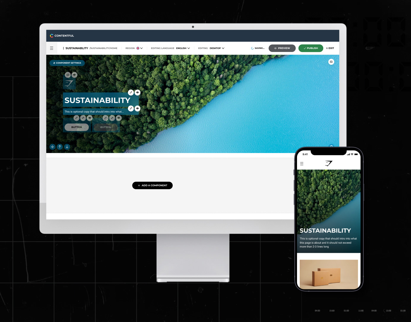
Redesigning the product detail page to shift from a transactional page to an immersive product education and storytelling experience.
Problem Statement
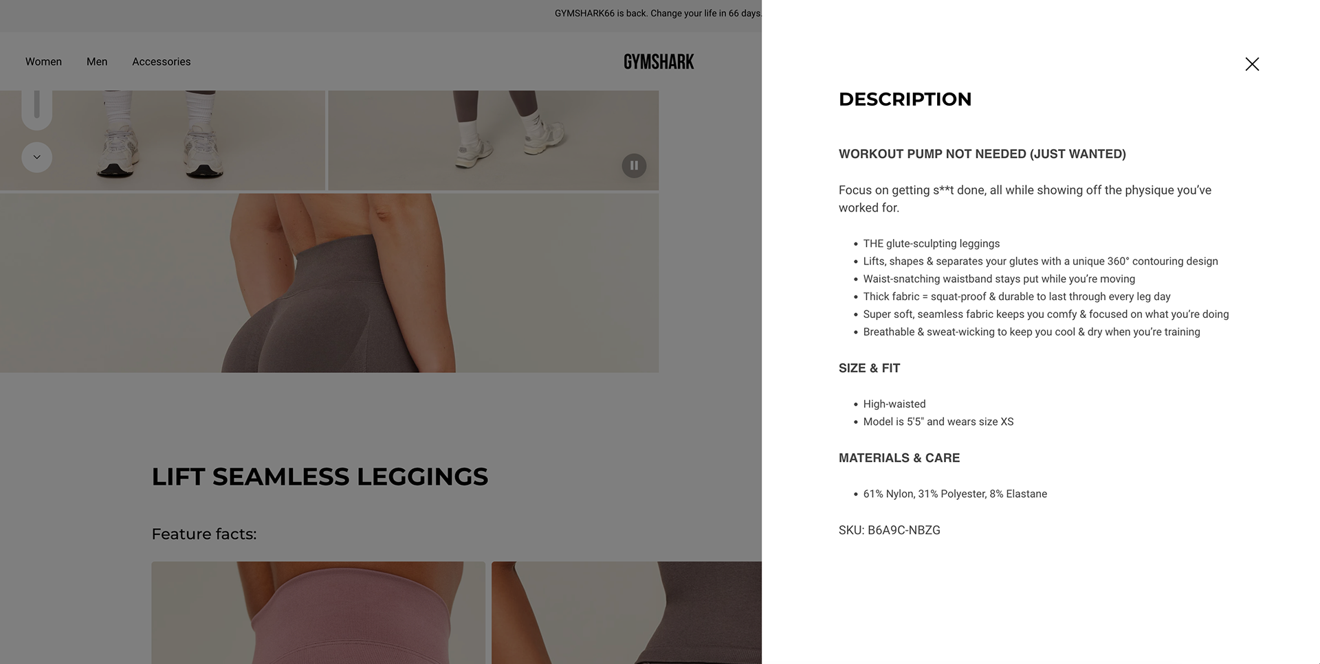
The existing PDP was a transactional dead-end — product information was hidden behind modals, storytelling was non-existent, and users had no reason to explore beyond the "Add to Cart" button, resulting in low product understanding, missed cross-sell opportunities, and higher return rates.
The original PDP had several core issues:
Lack of clarity on product intent
While descriptions existed, they were hidden inside a modal that few users opened. This meant shoppers often didn’t understand what the product was designed to do, leading to hesitation and drop‑off.
While descriptions existed, they were hidden inside a modal that few users opened. This meant shoppers often didn’t understand what the product was designed to do, leading to hesitation and drop‑off.
Hidden Material Benefits
Technologies like sweat‑wicking or seamless construction weren’t surfaced clearly, reducing perceived value.
Technologies like sweat‑wicking or seamless construction weren’t surfaced clearly, reducing perceived value.
Weak Visual Support for Product Fit
Without motion or context, it was hard for customers to imagine how the product performed during real activities.
Without motion or context, it was hard for customers to imagine how the product performed during real activities.
No Hierarchy Across Content Types
Designed intent, description, features, and sizing lacked structure, making the PDP feel fragmented and inconsistent.
Designed intent, description, features, and sizing lacked structure, making the PDP feel fragmented and inconsistent.
The result: uncertainty, lower confidence, lower trust, and reduced conversions
Old PDP & Description
What we did.
Designed For Preview
To help users immediately understand why a product exists, we introduced a short “Designed For” preview high up on the PDP info section.
Impact:
Increases engagement by giving users a clear, scannable reason to explore more.
Increases engagement by giving users a clear, scannable reason to explore more.
Design Detail:
A concise preview sentence appears above the fold.
Tapping it smoothly anchors users down to the full “Designed For” content section.
Builds an intentional narrative: “Here’s what this is, here’s why it's great for you.”
A concise preview sentence appears above the fold.
Tapping it smoothly anchors users down to the full “Designed For” content section.
Builds an intentional narrative: “Here’s what this is, here’s why it's great for you.”
Social Proofing
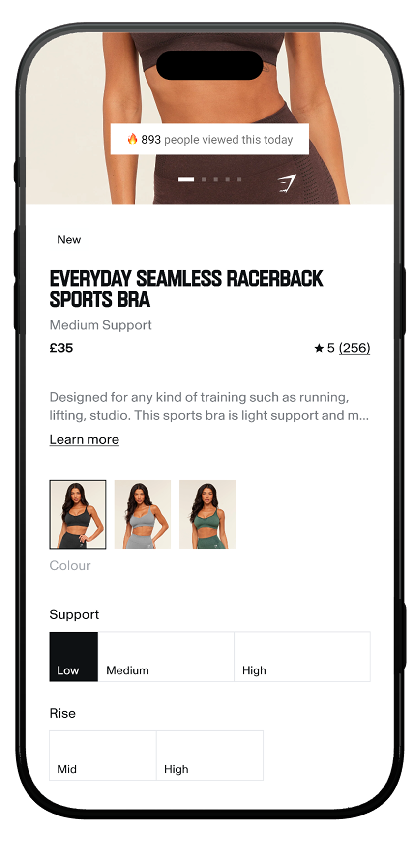
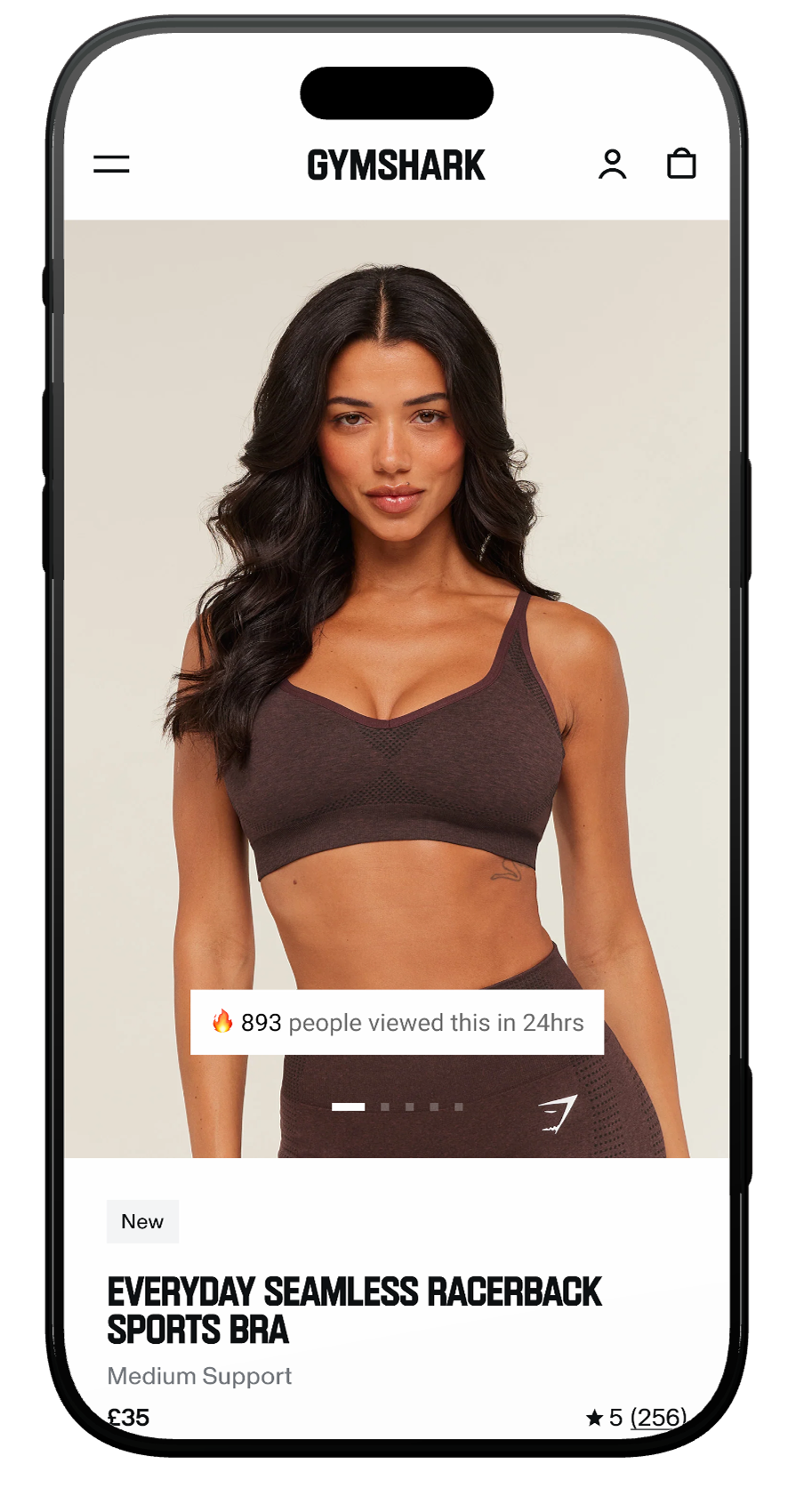
A refreshed product hero that pairs editorial-grade imagery with a real-time social proof banner, turning the first viewport into both a brand moment and a trust signal.
Impact: Builds immediate purchase confidence through visible demand — users see the product is popular before they even scroll.
Design Detail: "X people viewed this in the last 24hrs" badge overlaid directly on the image carousel, keeping it contextual rather than disruptive. Product title, price, rating, and support level are visible without scrolling — every key decision-making data point above the fold.
Results: £3M+ CVR Uplift
Designed For Paragraph
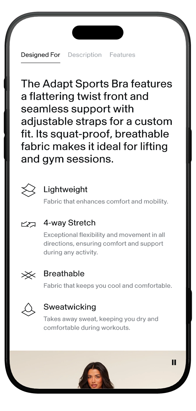
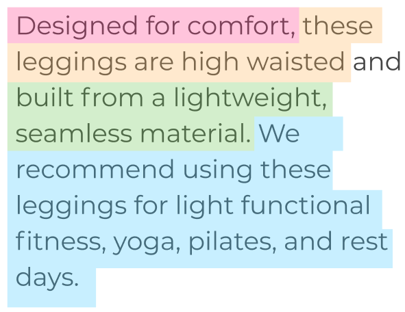
We rewrote and restructured the product intent narrative using a pre‑defined, user‑validated content model. Each paragraph clearly communicates:
- USP / Design intent (pink)
- Product fit (yellow)
- Material properties (green)
- Recommended activities (blue)
Impact:
Users reported far clearer understanding of purpose, fit, and benefits in UXR testing.
Users reported far clearer understanding of purpose, fit, and benefits in UXR testing.
Design Detail:
Conversational but direct tone.
High‑scannability structure that matches mental models.
Supporting bullet points and iconography for tech callouts (e.g., Breathable, Lightweight, Sweat‑Wicking).
A motion-led product video showcasing the garment in real movement so users can see drape, stretch, and comfort.
Conversational but direct tone.
High‑scannability structure that matches mental models.
Supporting bullet points and iconography for tech callouts (e.g., Breathable, Lightweight, Sweat‑Wicking).
A motion-led product video showcasing the garment in real movement so users can see drape, stretch, and comfort.
Motion Led Video Example
Footage in which the model is performing an activity is recommended. Or footage of how the garment falls, rises or stretches was preferred by users in UXR.
Description Enhancements
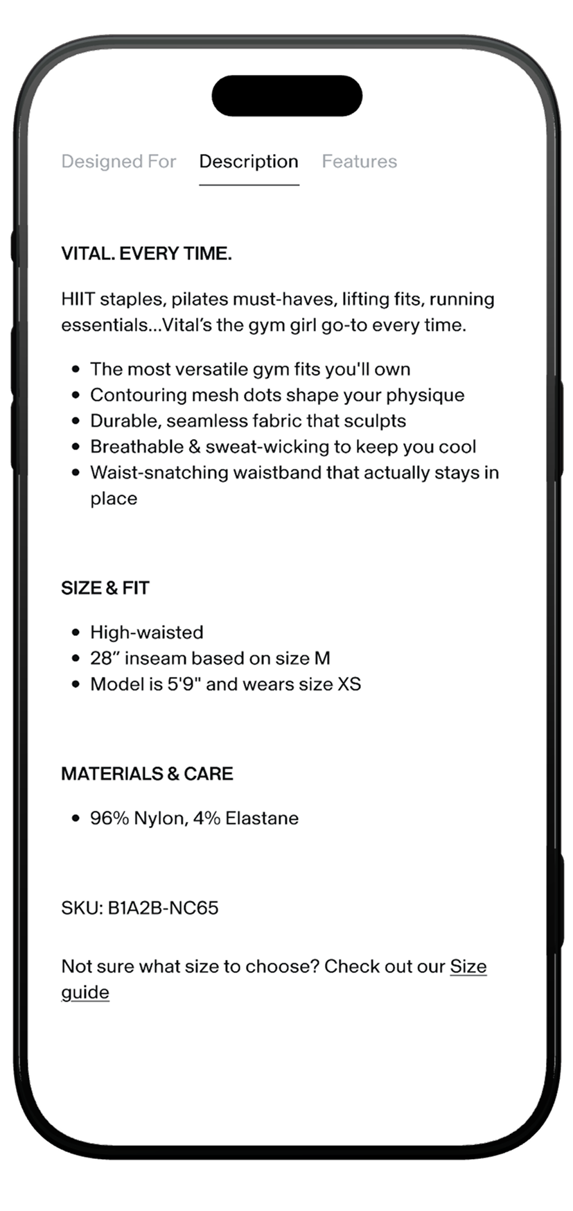
We kept the existing Shopify description but improved the experience around it.
Impact:
Greater readability and a clearer separation between marketing copy and functional detail.
Greater readability and a clearer separation between marketing copy and functional detail.
Design Detail:
Moved this from a separate accordion higher up the page into this section to create one main “product education” area on the PDP.
Increased font size + improved spacing for better scan patterns.
Added a dedicated Size Guide link beneath the description.
Moved this from a separate accordion higher up the page into this section to create one main “product education” area on the PDP.
Increased font size + improved spacing for better scan patterns.
Added a dedicated Size Guide link beneath the description.
Product Features Section
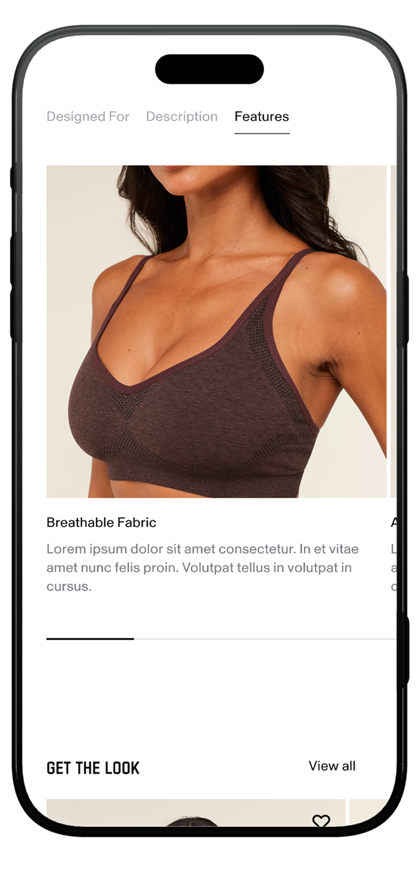
A newly envisioned, visual-first features module gives users a richer understanding of the product’s functional and emotional benefits.
Impact:
Customers connect more deeply to the product’s value proposition.
Customers connect more deeply to the product’s value proposition.
Design Detail:
High-quality macro images paired with concise copy.
Designed to complement the technical material attributes in the Designed For Tab, expanding the story from “what it’s made of” to “how it makes you feel.”
Modular, scalable, and consistent across product categories.
High-quality macro images paired with concise copy.
Designed to complement the technical material attributes in the Designed For Tab, expanding the story from “what it’s made of” to “how it makes you feel.”
Modular, scalable, and consistent across product categories.
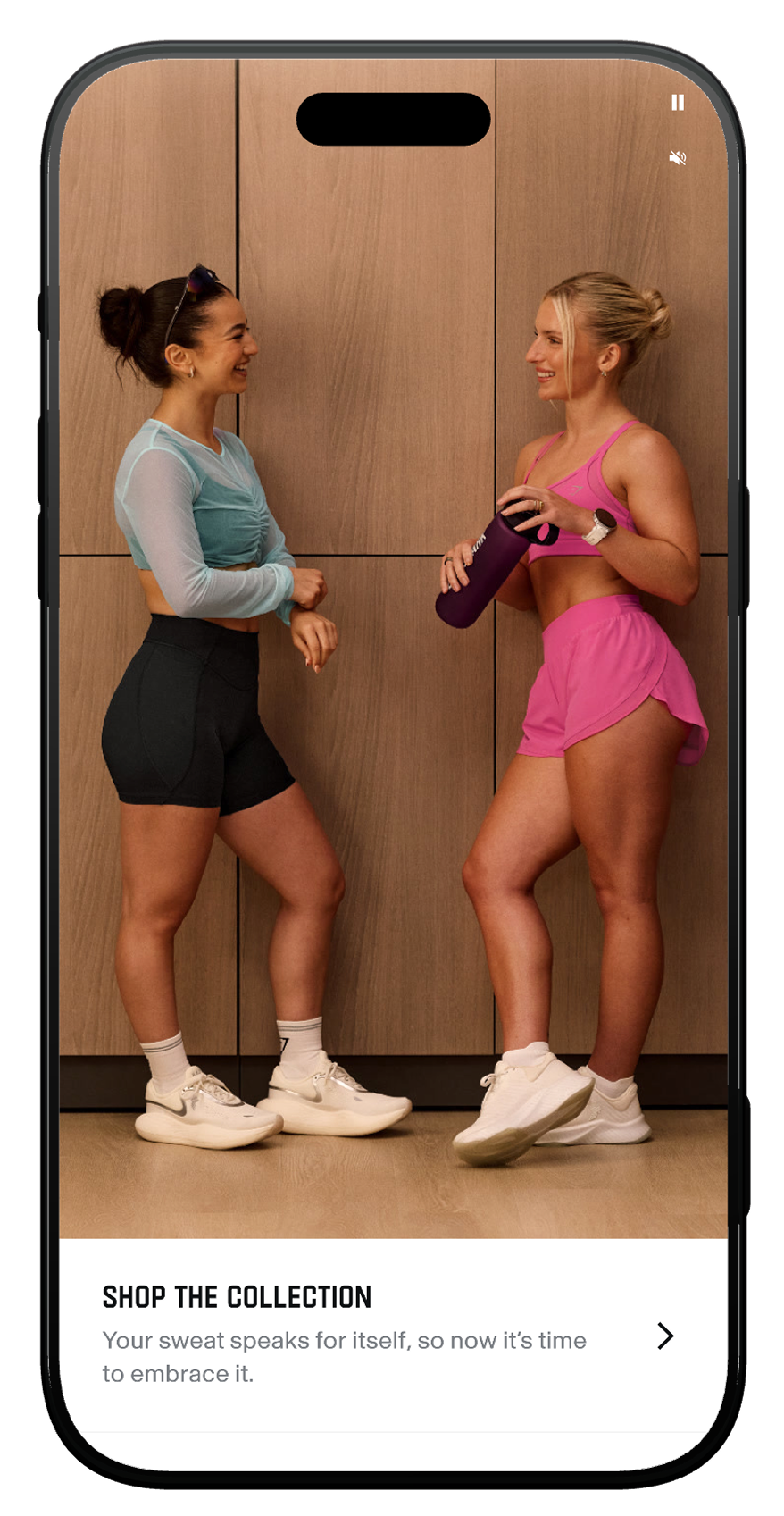
Collection Card
A full-bleed collection card that contextualises the product within a broader collection.
Impact: Users discover coordinating pieces and understand how the product fits into a styled, curated wardrobe — driving cross-sell at the collection level.
Design Detail: The Collection Card is deliberately restrained. It is not a second product page or a deep-dive into the collection. It is a window — designed to educate just enough, and entice the user to explore further.
Read the full case study on Collection Card.
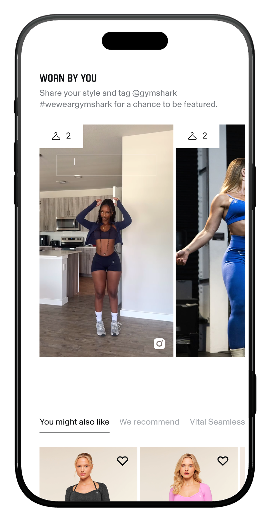
UGC — "WORN BY YOU"
A user-generated content module featuring real customers wearing the product, with a community prompt to share and tag for a chance to be featured.
Impact: Users see the product on real people with different body types and styling — building trust and relatability that studio photography alone cannot deliver.
Design Detail: Grid of customer-submitted images with engagement indicators (likes, comments) adding social validation. Community CTA ("Share your style and tag @gymshark") turns customers into content creators and brand advocates. Positioned after the brand's own content — studio hero, product education, collection card — so UGC acts as the final trust layer before recommendations.
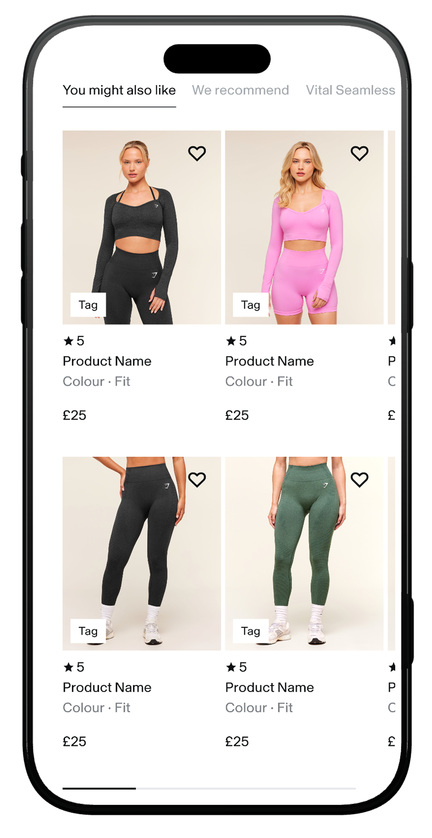
TABBED RECOMMENDATIONS
A multi-tab recommendation system offering algorithmic, curated, and collection-specific product suggestions — replacing multiple carousels.
Impact: Users discover more relevant products through multiple lenses, increasing basket size and reducing the chance of a dead-end exit.
Design Detail: Five tabs — You might also like, We recommend,Collection, Product Range and a colour tab (e.g., "Shop more Pink") — each serving a different intent. Product cards include rating, colour/fit metadata, pricing, and wishlist — enough to evaluate without tapping through. Tabbed format multiplies upsell surface area without adding visual clutter — one grid, five contexts.
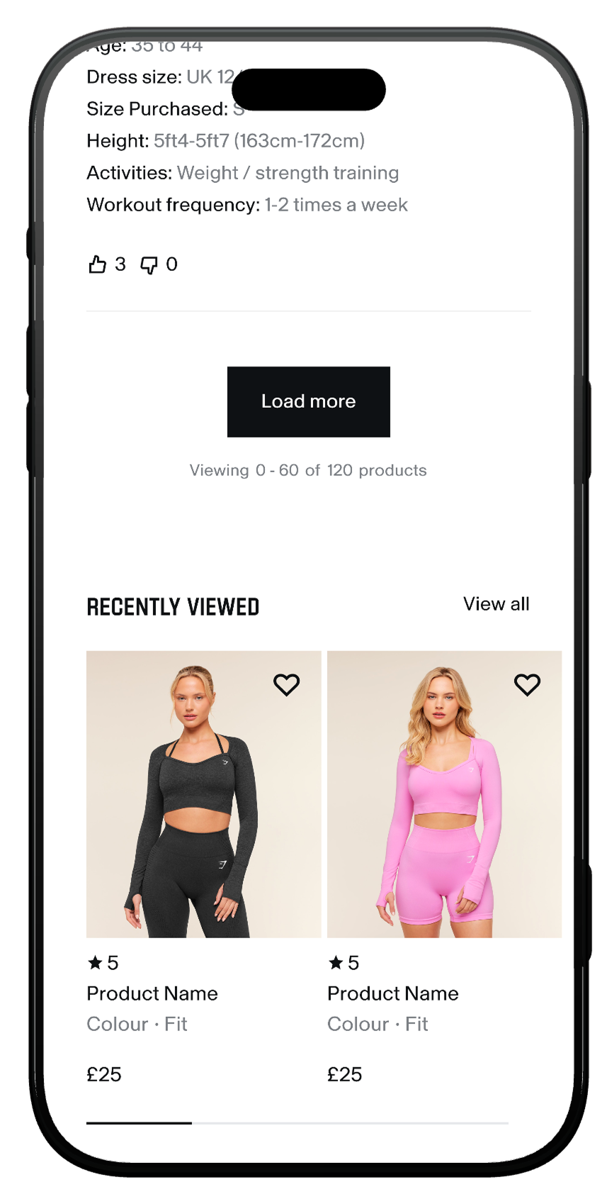
RECENTLY VIEWED
A persistent recently viewed row at the bottom of the page, keeping the user's browsing history accessible without back-button navigation.
Impact: Users comparison-shopping across multiple PDPs can quickly revisit considered products — staying in the purchase funnel instead of dropping off.
Design Detail: Horizontal product row with "View all" link — lightweight and non-intrusive. Shows ratings and pricing inline so users can compare at a glance without re-entering each PDP. Positioned as the final module on the page — a safety net for users about to leave.
User Research Feedback
"I like that it gives you options of different kinds of training that you can do with that, and I like that there's a video included as well”
🇺🇸 Jenny, USA
🇺🇸 Jenny, USA
"I really like that (the video) actually, because sometimes the pictures are not enough to see how it looks like or how it performs”
🇬🇧 Maisy, UK
🇬🇧 Maisy, UK
(speaking about the section they would look at first) "This section, Designed For... It's giving me an idea of what I can use it for”
🇺🇸 Rebecca, USA
🇺🇸 Rebecca, USA
"It's broken down well and it's easily digestible. There's no massive paragraphs of what the material is or what it's useful for, it's just straight to the point, which most people want”
🇬🇧 Kim, UK
🇬🇧 Kim, UK
"It definitely gives enough information, I would say it's much more than I see in pages from other brands”
🇺🇸 Sam, USA
🇺🇸 Sam, USA
(talking about materials and care section) "It tells you what not to do so 'Don't tumble dry', pretty self-explanatory and I would say it's very informative, it's easy to find”
🇬🇧 Hannah, UK
🇬🇧 Hannah, UK
Summary
The redesigned PDP helps users answer the essential purchase questions:
Is this product right for me?
Is this product Popular?
How will it fit me?
How does it fit on real people?
What can I actually use it for?
Why is it worth the price?
By structuring content around real user needs and surfacing the information that matters most, the PDP now delivers a far more intuitive, confidence‑building e‑commerce experience.