Problem Statement
Our product pages have become significantly better at educating customers on what they are buying. Features like Designed For help users understand quickly who a product is built for and what it does.
But there is a layer of context that sits beyond the individual product: the collection it belongs to. Each Gymshark collection has its own campaign identity, a visual world, a set of USPs that make it distinct. And for a large proportion of customers arriving directly from social or search, that world is entirely invisible.
They land mid-funnel. No browse, no collection context. Just a product, with nothing around it. We were asking them to make a decision without the full picture.
"A customer landing on a Vital PDP from TikTok has no idea they are looking at one of our most considered, story-driven collections. That context lives elsewhere. It should live here too."
Hypothesis
IF — we surface the Collection Card on our Collection PDPs, giving customers immediate visibility of the collection USPs and campaign identity.
THEN — we will see an increase in Add-To-Cart Rate, Conversion Rate, and Average Order Value across tested collections.
BECAUSE — the user can see the Collection USPs quickly, understand what they are buying into, and make a more informed, confident purchase decision.
The Feature
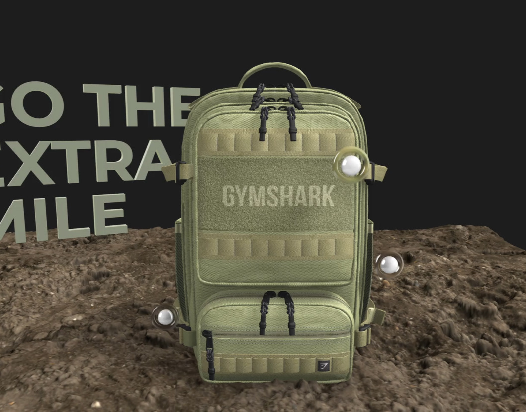
The Collection Card is deliberately restrained. It is not a second product page or a deep-dive into the collection. It is a window — designed to educate just enough, and entice the user to explore further.
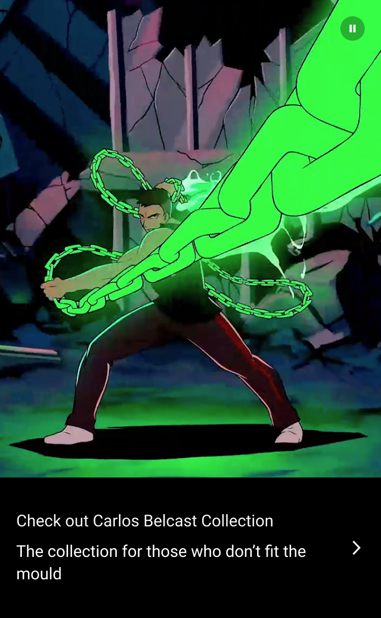
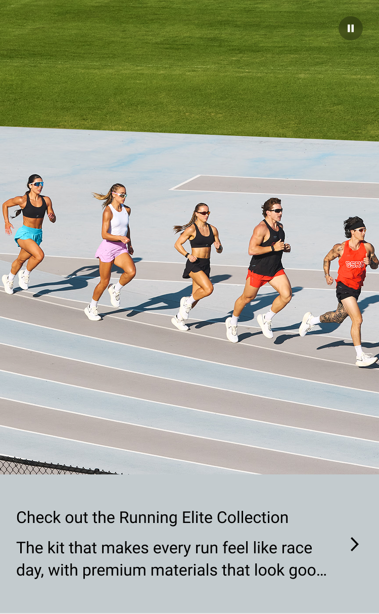


Creative Media Asset
Campaign imagery or video pulled directly from the collection's visual identity. The card takes on the full look and feel of that campaign — not a generic UI component, but a dynamic creative surface that changes with each collection drop.
Collection Title
Immediately tells the user which collection they are looking at and anchors the product in a broader world. For a customer who arrived cold from search or social, this is often the first moment of recognition.
USP Description
A brief, punchy description of the collection's core value propositions, written to educate and excite rather than to sell. Enough to make the user curious. Not so much that they feel lectured. One tap takes them to explore the full collection.
"The job of the card is not to tell the whole story. It is to make the user want to find out more."
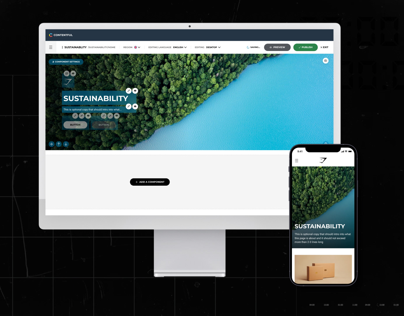
Design Process
The most important design decision was not what the card contains, but how it looks. The brief was clear: this should feel like an extension of the campaign, not a UI overlay on top of it.
Campaign Identity Alignment
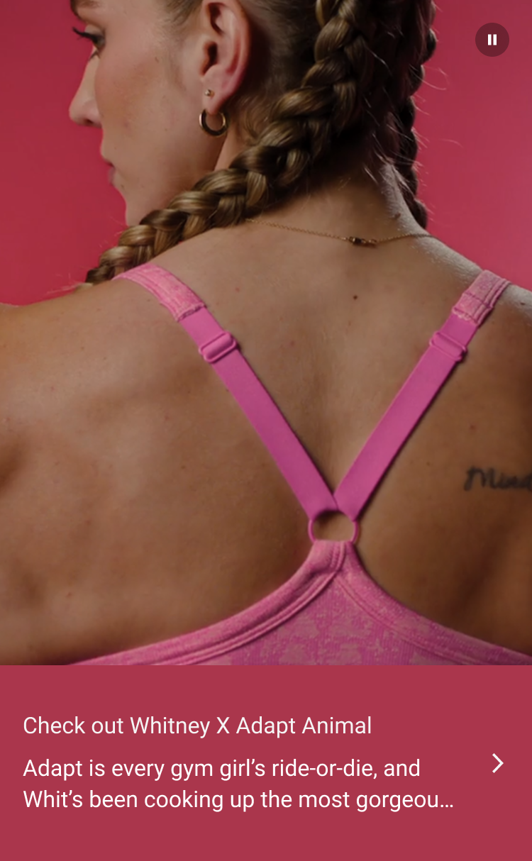
We worked closely with the Creative team to ensure the card inherits the full visual identity of each collection's campaign. Whether it is the bold energy of Adapt Animal or the detail-built, worn-for-the-work world of Gymshark x CBUM, the card adapts to feel native to that collection rather than generic. Campaign colours, photography treatment, and video direction all feed directly into the component.
Content Strategy
Working with the Content team to define what the USP description should and should not do. The brief was to distil an entire collection into two or three lines that educate without overwhelming. Every word earns its place. The tone matches the campaign rather than defaulting to product copy conventions.
Collections Tested
The test ran across six collections to ensure the card worked across different campaign styles, visual treatments, and customer demographics: Adapt Animal Whitney, Carlos Belcast, Minimal Sports Bra, Running Elite, Everyday Seamless, and Conditioning Club. Each required the component to feel genuinely different while remaining structurally consistent.
Engineering & Scalability
Working with Engineering to build a component that could dynamically adapt to campaign assets across collections and markets at scale. The card needed to feel handcrafted for each collection while being technically systematic — pulling in creative assets, colours, and copy from a structured content model rather than requiring manual implementation per collection.
Results
The test returned a mixed but encouraging result. The feature showed no meaningful impact on add-to-cart behaviour, but a statistically supported uplift in overall conversion — suggesting that surfacing collection-level context helps customers commit to a purchase even if it does not change their initial intent to add.
Summary
The PDP is not the end of the journey. It is a starting point. The Collection Card gives customers a reason to go deeper — into the world, the story, the collection. That is the design goal. And the data says it is working.