Redesigning the Shopping Bag Experience to Drive Conversion and Clarity
I led a comprehensive redesign of the shopping bag experience to address usability issues, improve promotional visibility, and increase conversion rates.
The previous bag design was cluttered, inefficient, and failed to support key business goals such as upselling and promotional engagement. Through a series of targeted improvements, we transformed the bag into a streamlined, conversion optimised touchpoint that better serves both users and commercial objectives.
Problem Statement
The original bag design presented several challenges:
Clunky Layout: Oversized product tiles dominated the screen, pushing key messages and actions out of view.
Poor Messaging Hierarchy: Important promotional and upsell messages were buried or repeated in ways that felt redundant and confusing.
Limited Promotional Support: The bag lacked a clear structure for showcasing promotions, leading to missed opportunities for engagement.
Ineffective Upselling: Upsell items were placed too far down the page and lacked contextual relevance.
Trust and Clarity Issues: Users were unsure about gift card redemption and payment options, which created friction at checkout.
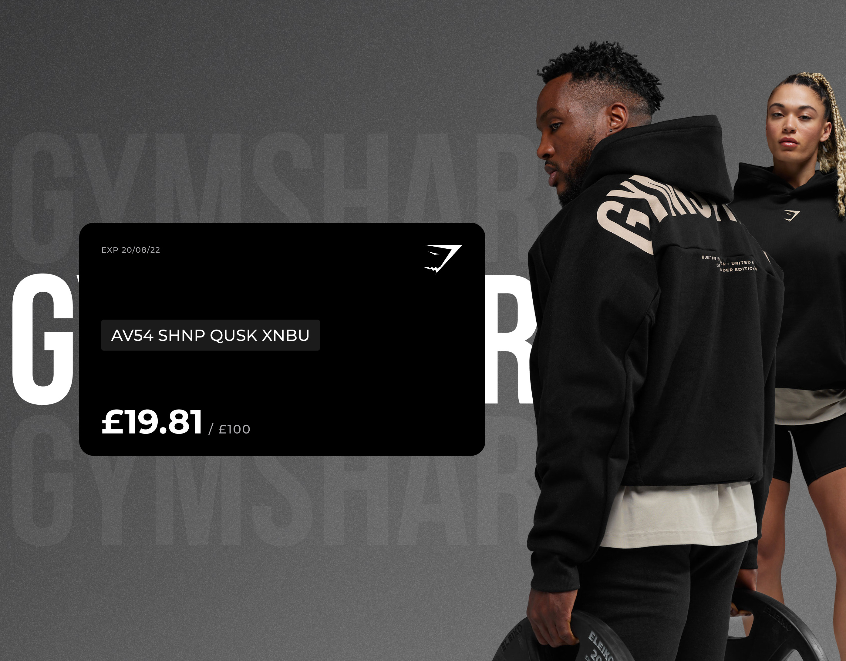
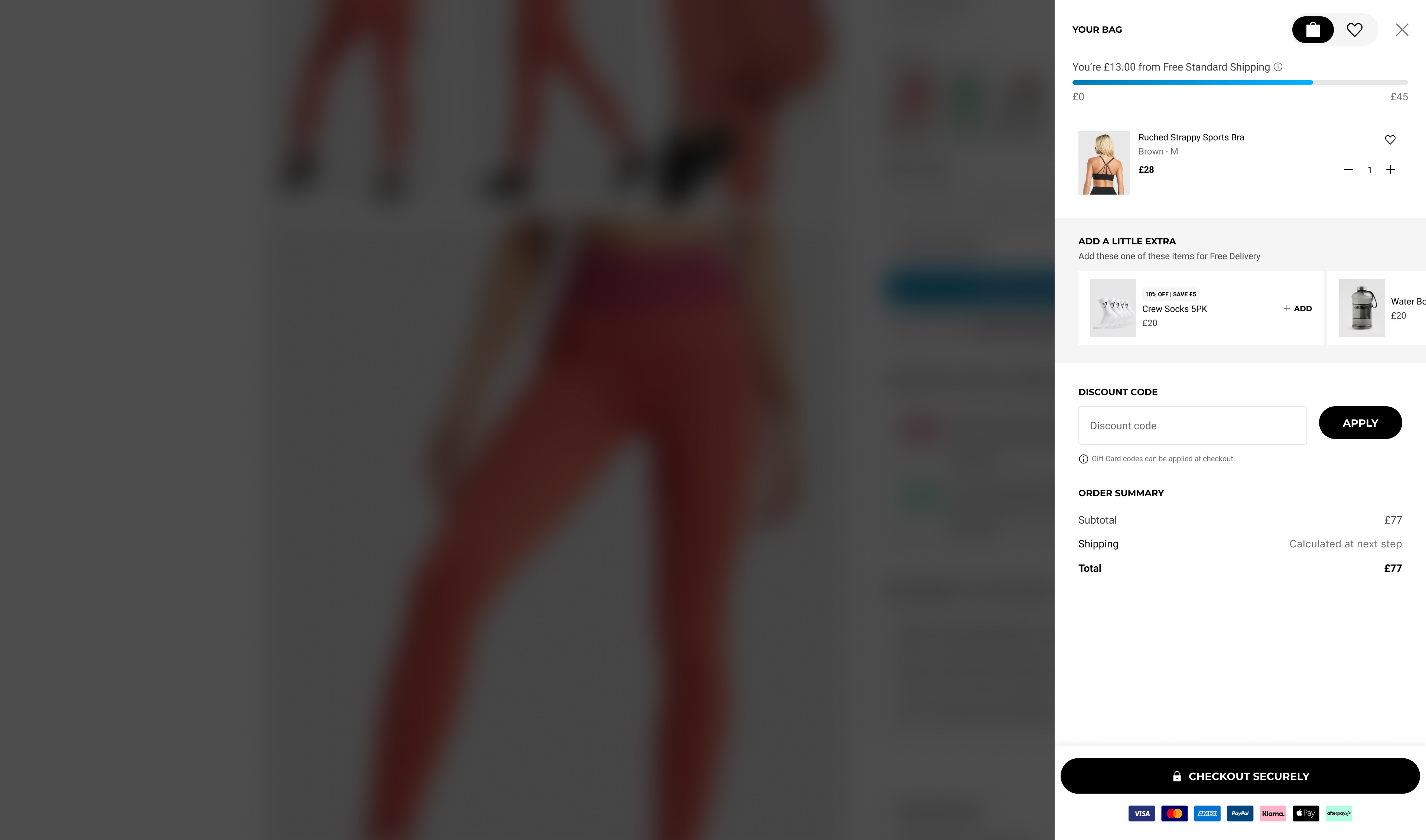
Original Bag Design
New Bag Feature Improvements & Additions
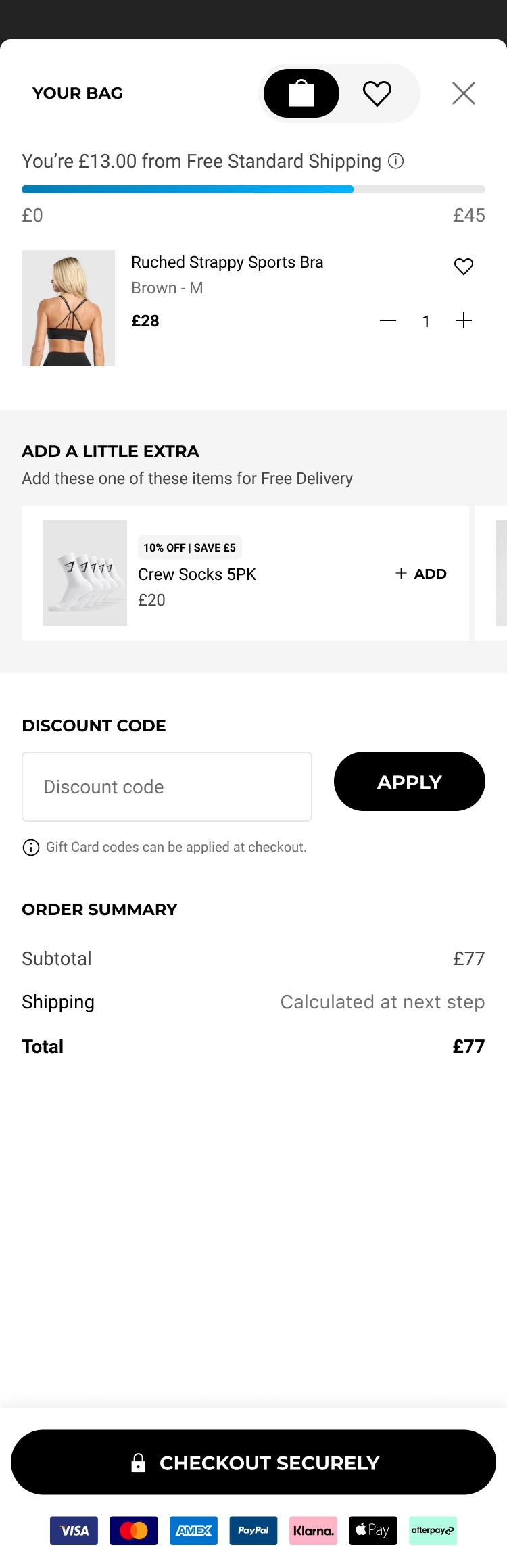
Improved Delivery Threshold Animation
We introduced a dynamic animation that visually tracks progress toward the free delivery threshold. This subtle but effective cue helps users understand how close they are to unlocking free shipping, encouraging additional purchases.
Impact: Increased average order value by nudging users to add more items.
Design Detail: A progress bar with micro-interactions that update in real-time as items are added.

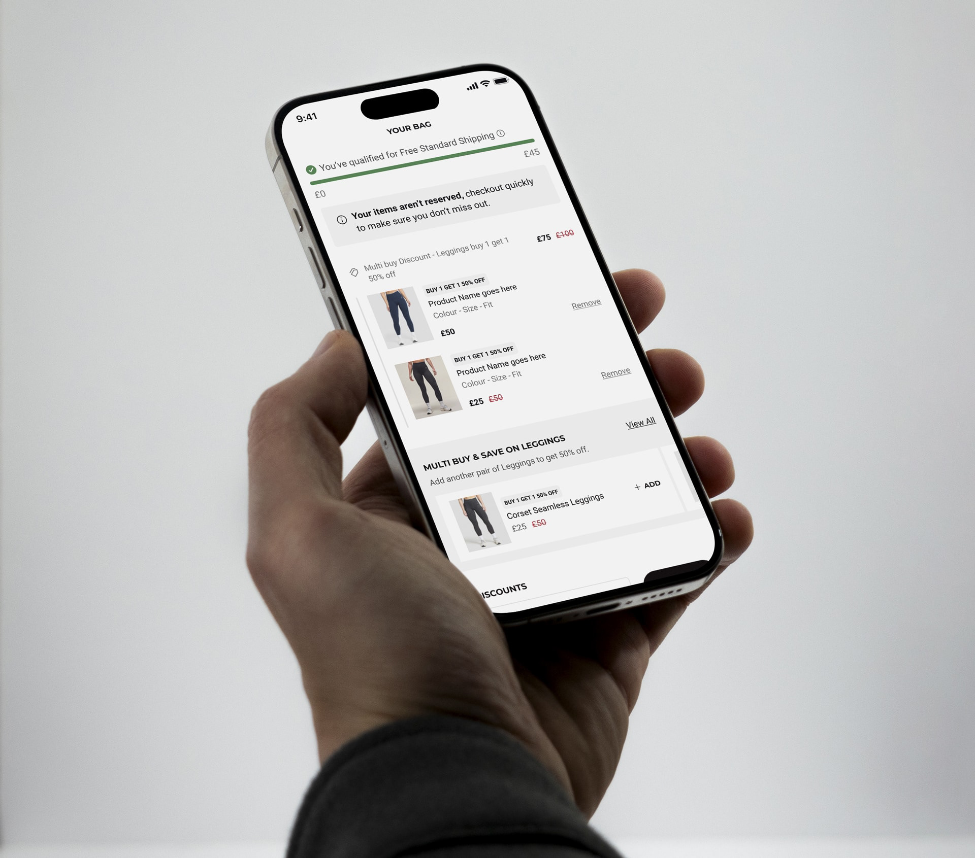
Urgency Messaging
To create a sense of urgency, we added contextual messages such as “Only 2 left in stock” or “Your items aren't reserved!” directly within the bag.
Impact: Boosted conversion rates by leveraging scarcity psychology.
Design Detail: Styled with alert icons and positioned near the top of the bag for visibility.

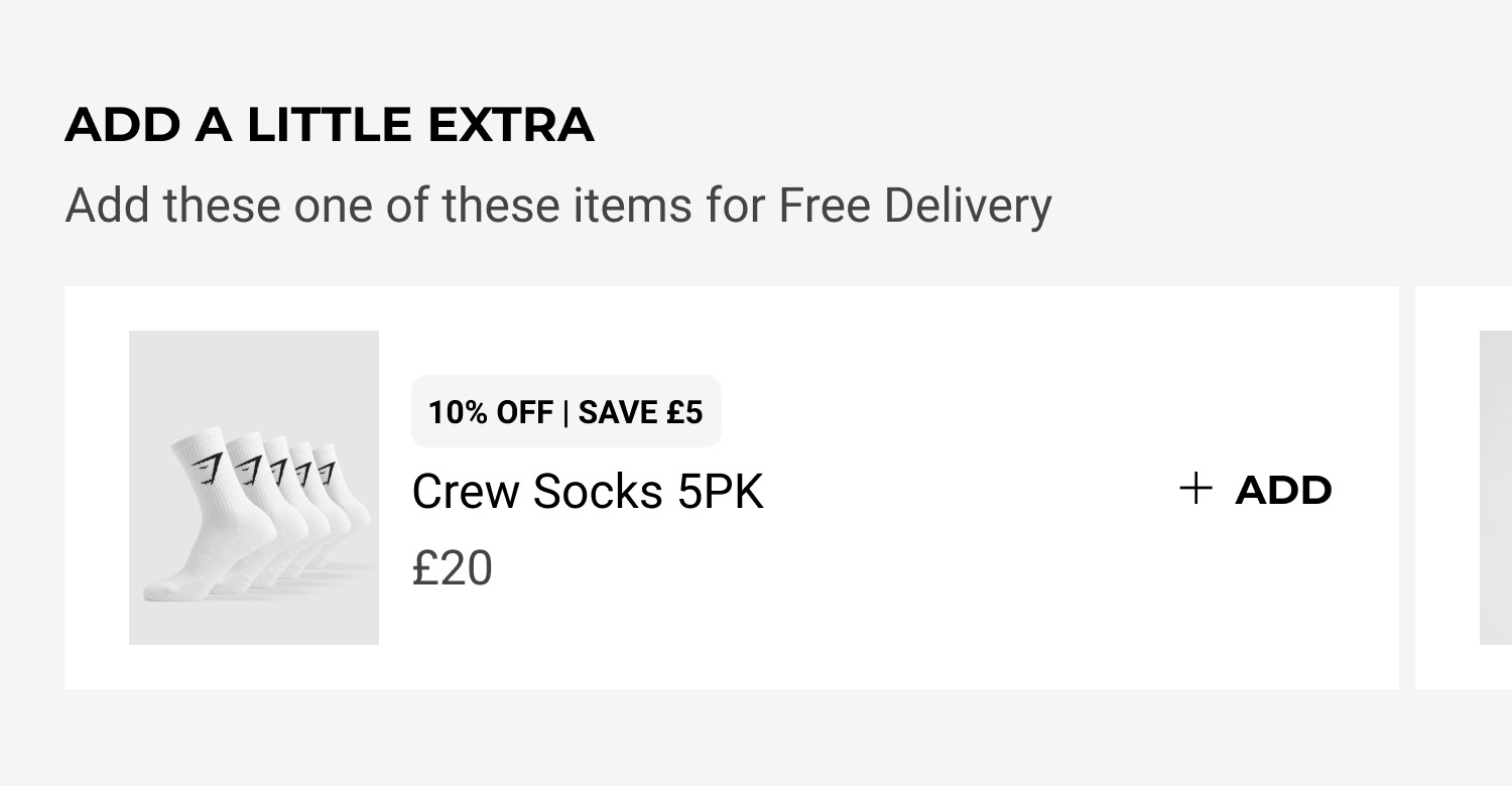
Promotion Support with Clear Grouping & Qualification Messaging
We restructured the bag to better support promotional campaigns. Promotions are now grouped visually, with clear qualification criteria and messaging that avoids repetition.
Impact: Improved user understanding of promotions and qualified status.
Design Detail: Modular promo blocks with icons, qualification status, and clearer pricing and discount breakdowns.
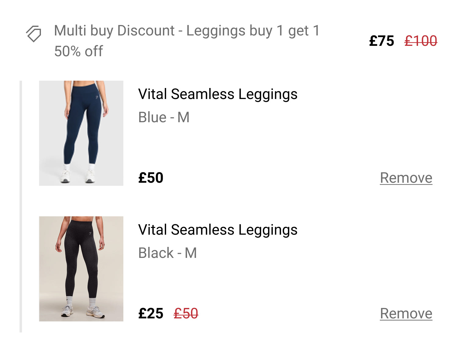
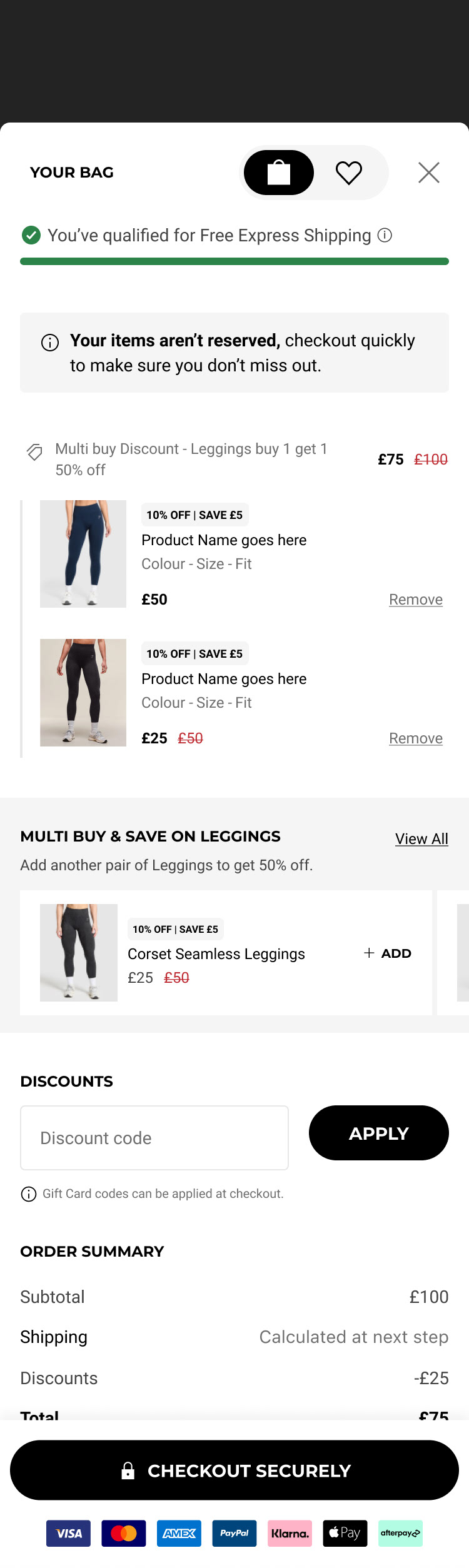
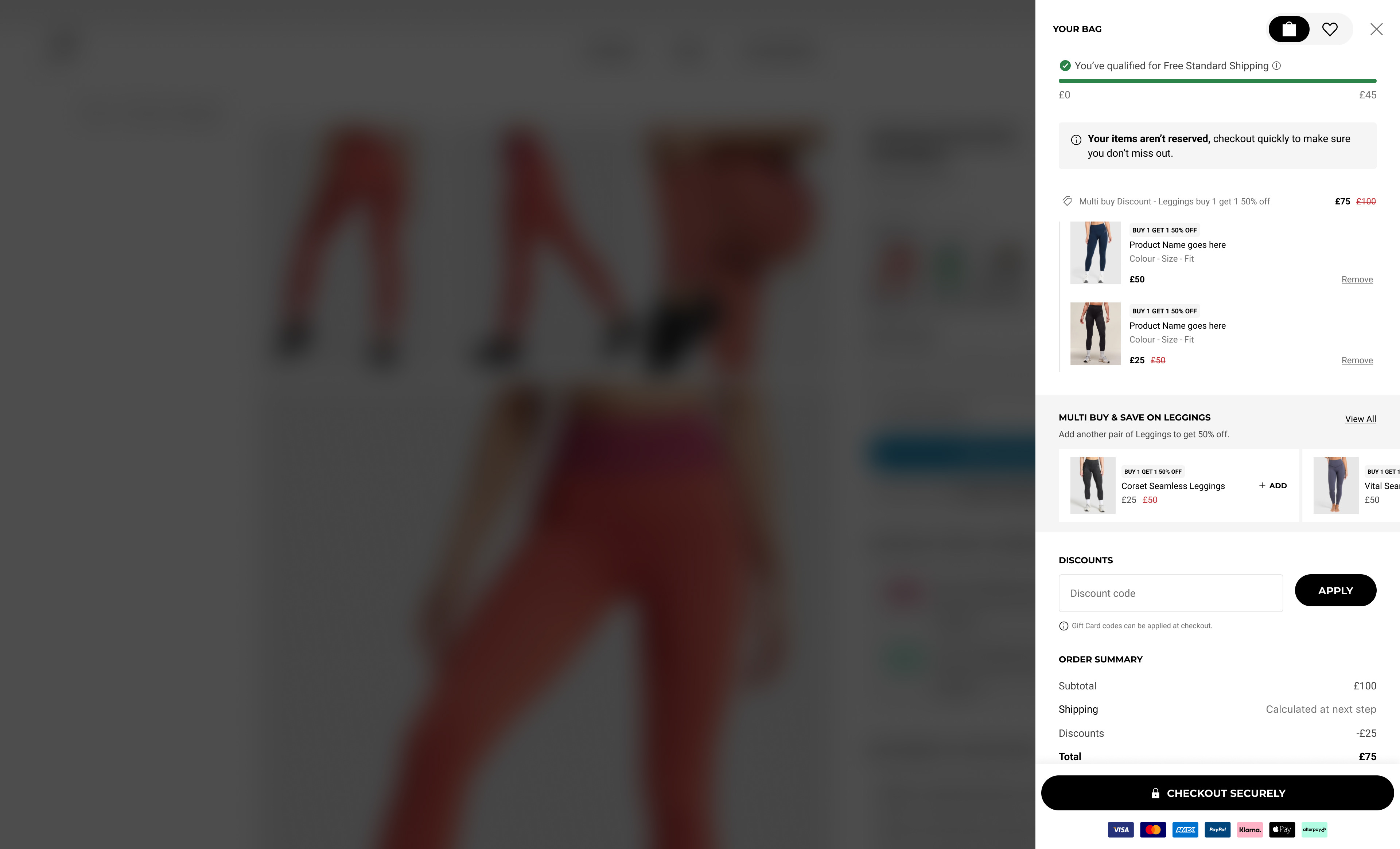
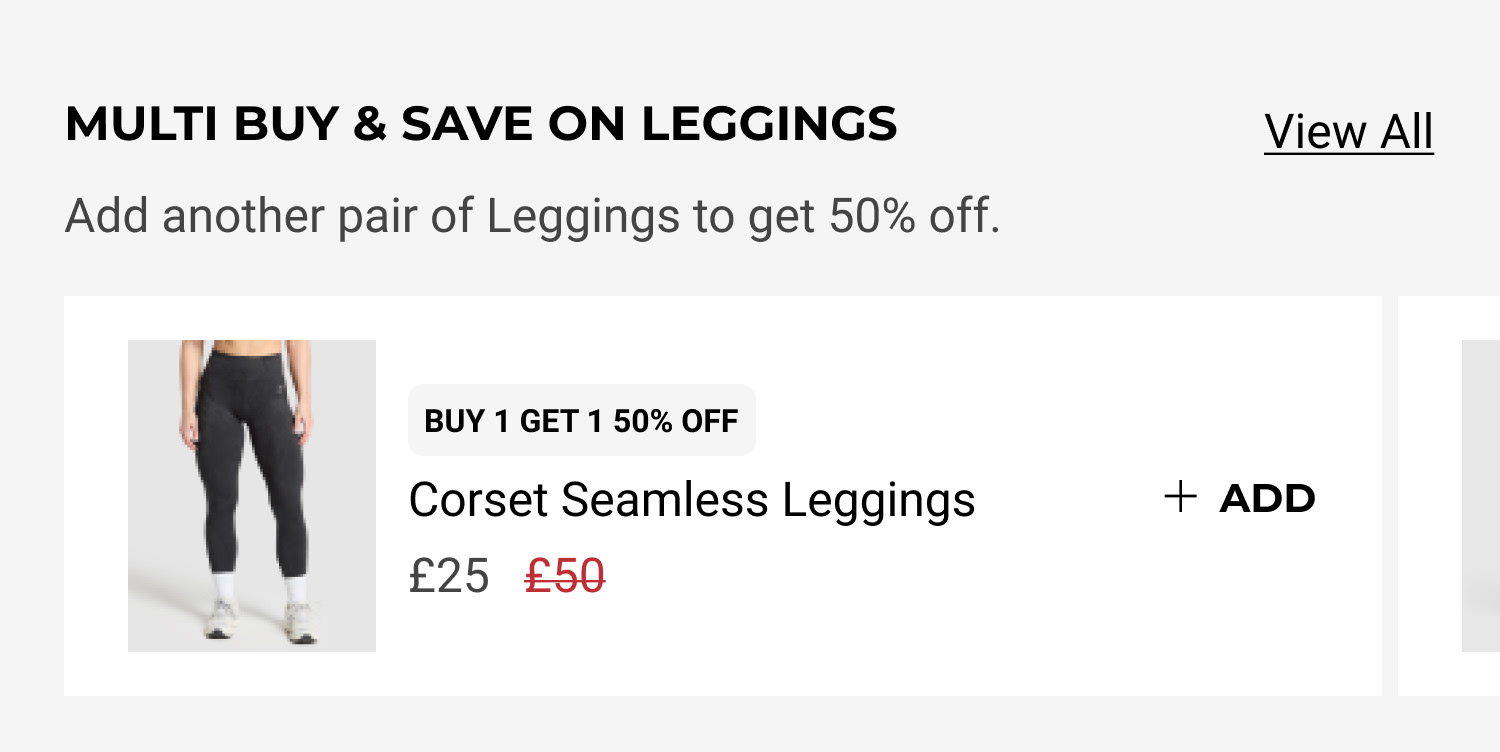
Streamlined Upsell Section
We redesigned the upsell area to feature smaller, relevant accessory items that help users reach the delivery threshold without overwhelming them. As well as added support for upselling specific items within a promotion.
Impact: Increased accessory sales and helped users unlock free delivery more easily and displayed more relevant upsell products.
Design Detail: Horizontally scrollable carousel with curated suggestions based on cart contents or promo status.
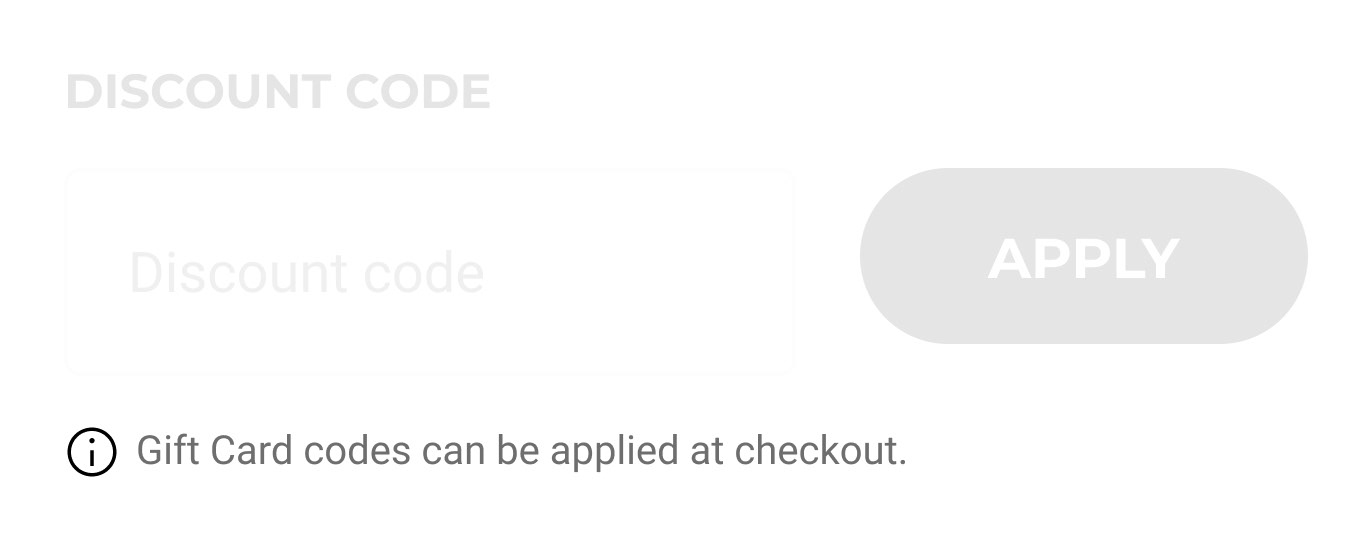
Helpful Notes for Gift Card Redemption
To reduce confusion, we added a clear note explaining that gift cards can only be redeemed at checkout.
Impact: Reduced unsuccessful code entries into the discount field and improved checkout clarity.
Design Detail: Inline tooltip and static message near the gift card entry field.
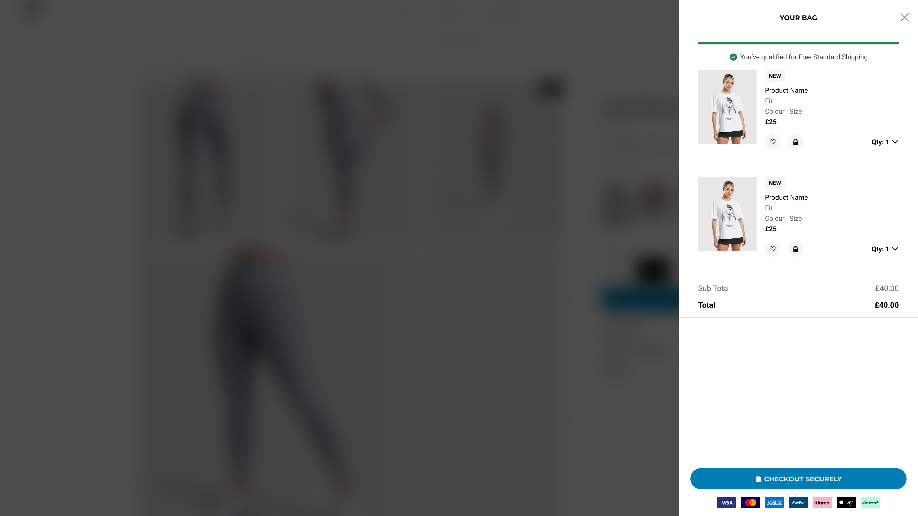
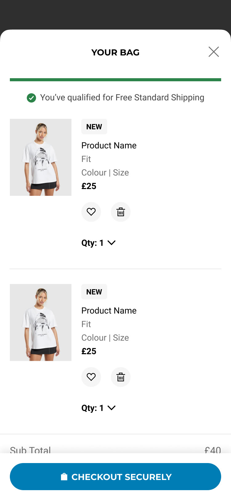
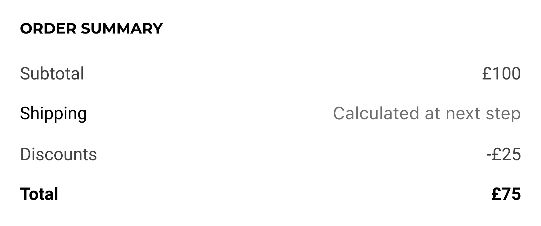
Simplified Order Summary
We decluttered the order summary by removing redundant information and improving hierarchy. Key totals and savings are now more prominent.
Impact: Enhanced readability and reduced cognitive load.
Design Detail: Clean typography, spacing, and use of icons to separate sections.
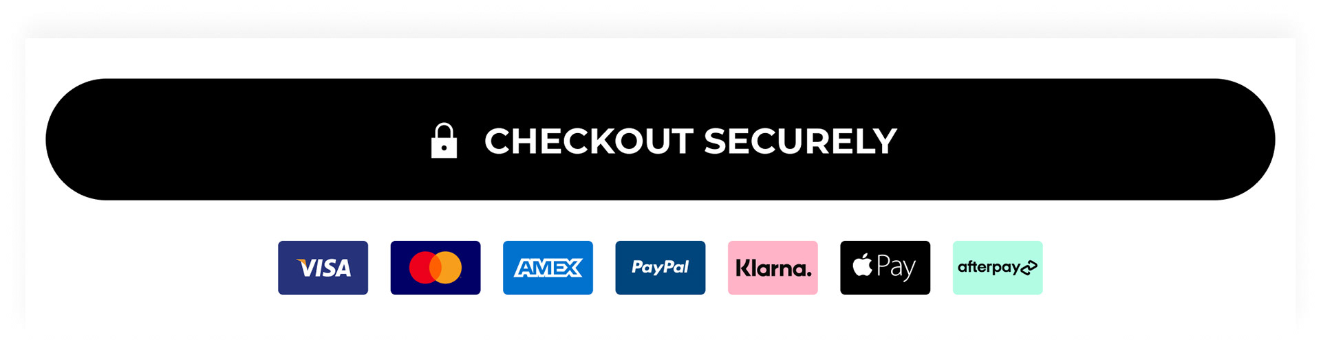
Payment Icons for Trust
We added recognisable payment method icons (Visa, Mastercard, PayPal, etc.) to reassure users of secure and flexible payment options.
Impact: Increased trust and reduced cart abandonment.
Design Detail: Displayed near the checkout CTA with subtle animation on hover.
Results
⬆ Quantity Picker interactions increased
⬆ CVR & AOV Uplift3
Community Feedback
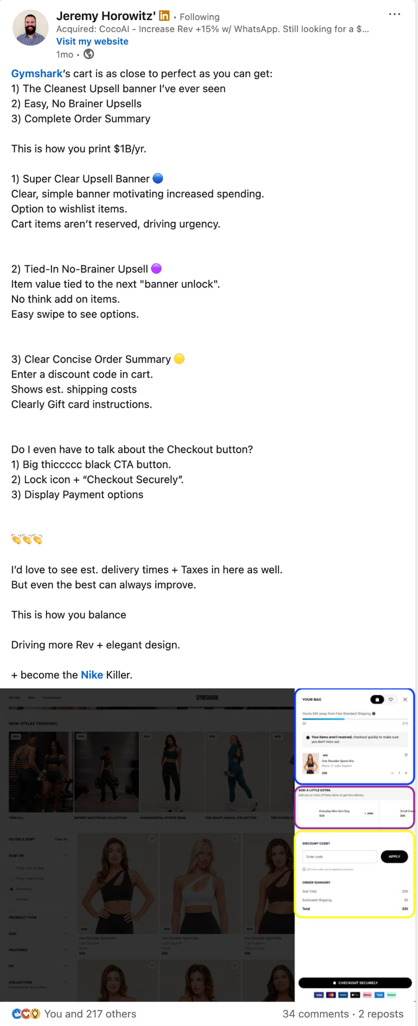
The redesigned shopping bag experience also received notable recognition within the LinkedIn product and e-commerce community.
A post highlighted the effectiveness of the new cart design, praising its clear upsell banner, streamlined upsell options, and complete order summary—all key elements from the redesign.
The post resonated strongly, garnering 217 likes, 34 comments, and 2 reposts, reflecting high engagement and validation from industry professionals. Many comments echoed appreciation for the clarity and conversion-driven approach, with some suggesting further enhancements like estimated delivery times and tax previews. This feedback not only affirmed the design direction but also sparked valuable dialogue around best practices in cart UX for high-growth e-commerce brands.
In conclusion
This redesign was a strategic blend of UX clarity, behavioural nudges, and commercial optimisation. By addressing core usability issues and aligning the bag experience with user expectations and business goals, we created a more intuitive and effective shopping journey.