In a world where noise is constant, how do you design a Blog that speaks softly but leaves a lasting impact?
This question became the heart of our journey as we reimagined Gymshark’s blog experience. We wanted to create a space where our readers could not only find the bold energy that defines our brand but also have the freedom to explore content in a way that resonated with them.
The Concepts
We started by envisioning three distinct concepts – Bold, Social, and Studio – each with its own approach to engaging our community. But as we delved deeper, it became clear that only one would allow us to speak in a way that truly connected with our audience, without adding to the constant noise surrounding us.

Bold Concept
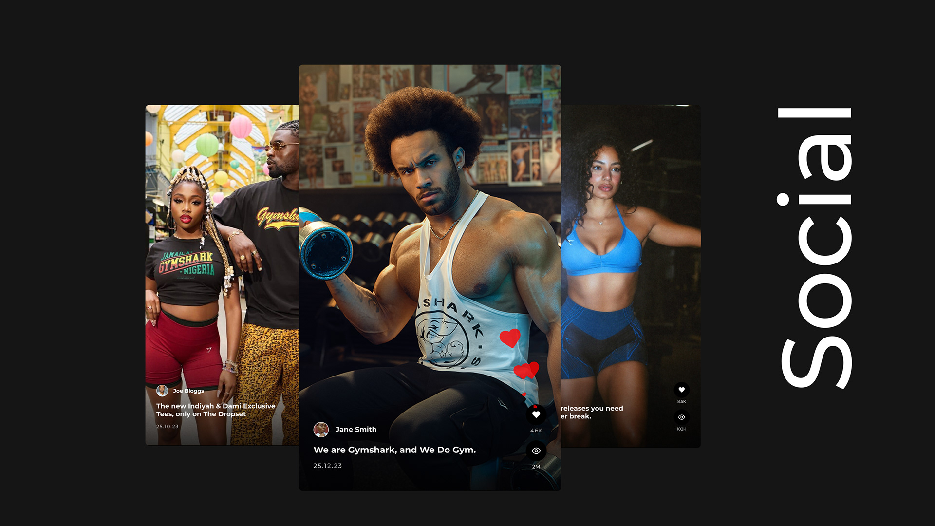
Social Concept
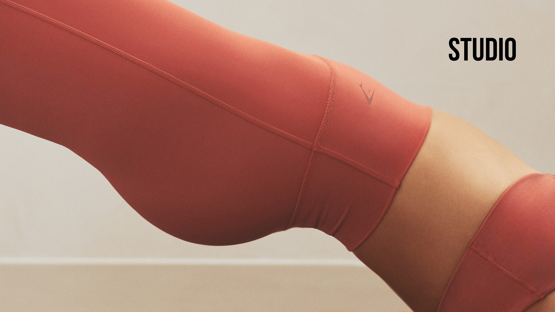
Studio Concept
Bold
The very word conjures images of strength, intensity, and impact — the core of what Gymshark represents. When we envisioned Bold as a concept for our blog, we saw an experience that was larger than life. Imagine landing on a page where every image jumps out at you, where the typography is unapologetically loud, demanding your attention with every headline, and every sentence. It was a visual assault, in the best way possible, a pure distillation of the energy and power that Gymshark embodies.
Bold Moodboard
As we immersed ourselves in the Bold concept, something became clear. As striking as it was, it could also be overwhelming. Imagine trying to read through an article when every word is shouting at you, every image competing for your attention. Bold had an impact, yes, but it also had the potential to alienate. For a blog — a space typically meant for thoughtful reflection, learning, and connection — this approach risked becoming more noise than value.
Social
In an era dominated by Instagram stories, TikTok trends, and YouTube shorts, we saw an opportunity to reimagine the blog as a social hub. The idea was to create a dynamic and fast-paced experience filled with bite-sized video content, interactive elements, and a stream of ever-changing stories. It was different, fresh, and undeniably engaging.
Social Moodboard
When we put ourselves in the shoes of our readers, doubts began to surface. Would this fast-paced, social-media-inspired experience serve the deeper purpose of a blog? Blogs are spaces for contemplation, for diving deep into subjects that matter. Could we really achieve that with a format designed for quick consumption? The risk here was profound.
Studio
From the moment we began to sketch out this idea, something just clicked. Studio was about creating a space — calm, inviting, and open.
Picture this: a digital environment where you could escape the noise of the internet, a place designed not to bombard you but to welcome you, much like a yoga studio welcomes you to breathe and find balance. The layout was clean and spacious, with content arranged thoughtfully, allowing each article to stand on its own, giving the reader the freedom to explore at their own pace.
Studio Moodboard
As we immersed ourselves in this concept obsessing over every pixel, we began to understand its power. Studio wasn’t just about aesthetics; it was about creating an experience that aligned with the very purpose of a blog. A blog should be a sanctuary for thought, a place where you can lose yourself in a story, dive into a subject, or simply browse through ideas without feeling rushed.
The Studio concept gave us exactly that. It was a space where Gymshark’s bold energy was present, but in a way that supported contemplation rather than stifled it. The content was still impactful, still powerful, but it was delivered with a mindfulness that respected our readers’ time and attention.
It provided an environment where Gymshark’s message could be delivered with impact, but without overwhelming. It allowed us to create a blog that was not just another extension of our brand, but a new way for our community to engage with us — thoughtfully, deeply, and on their terms.


Check out the new Gymshark blog https://uk.gymshark.com/blog

