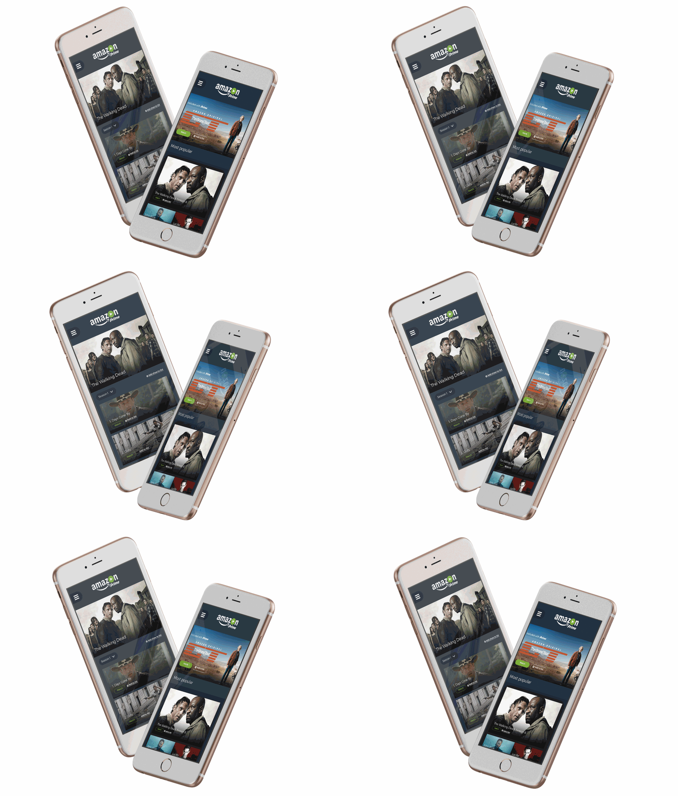
Customer Value Landing Page
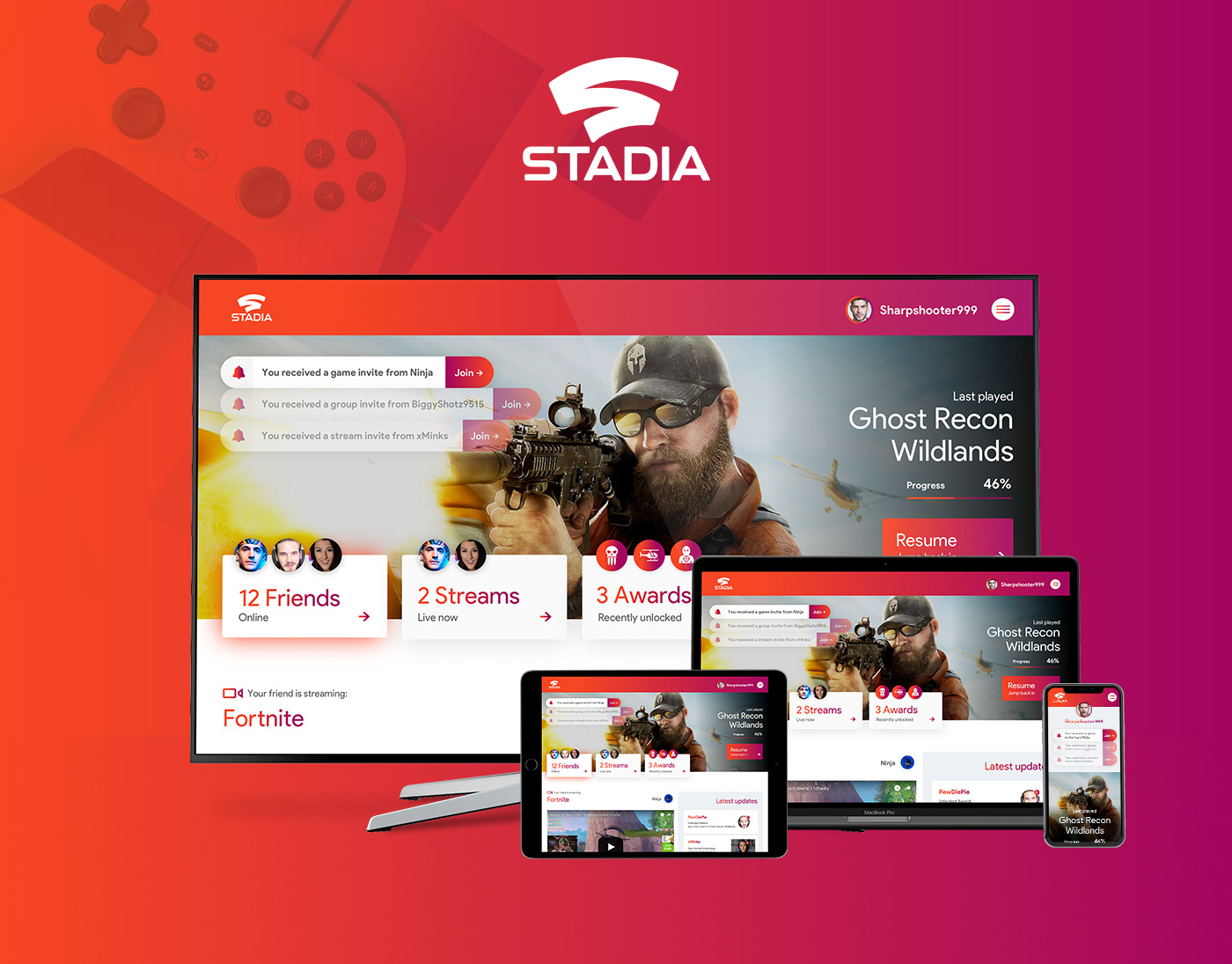
As part of a broader initiative, this project created a fun, Spotify Wrapped-style hub where users could explore their service usage and data consumption. I led the creative direction, collaborating with an agency and in-house designers to present insights in a joyful, on-brand way. The experience was well received by users and the business and continues to be promoted years later.


Set-top box (pro-active alert)
Digital Cancellation Journey
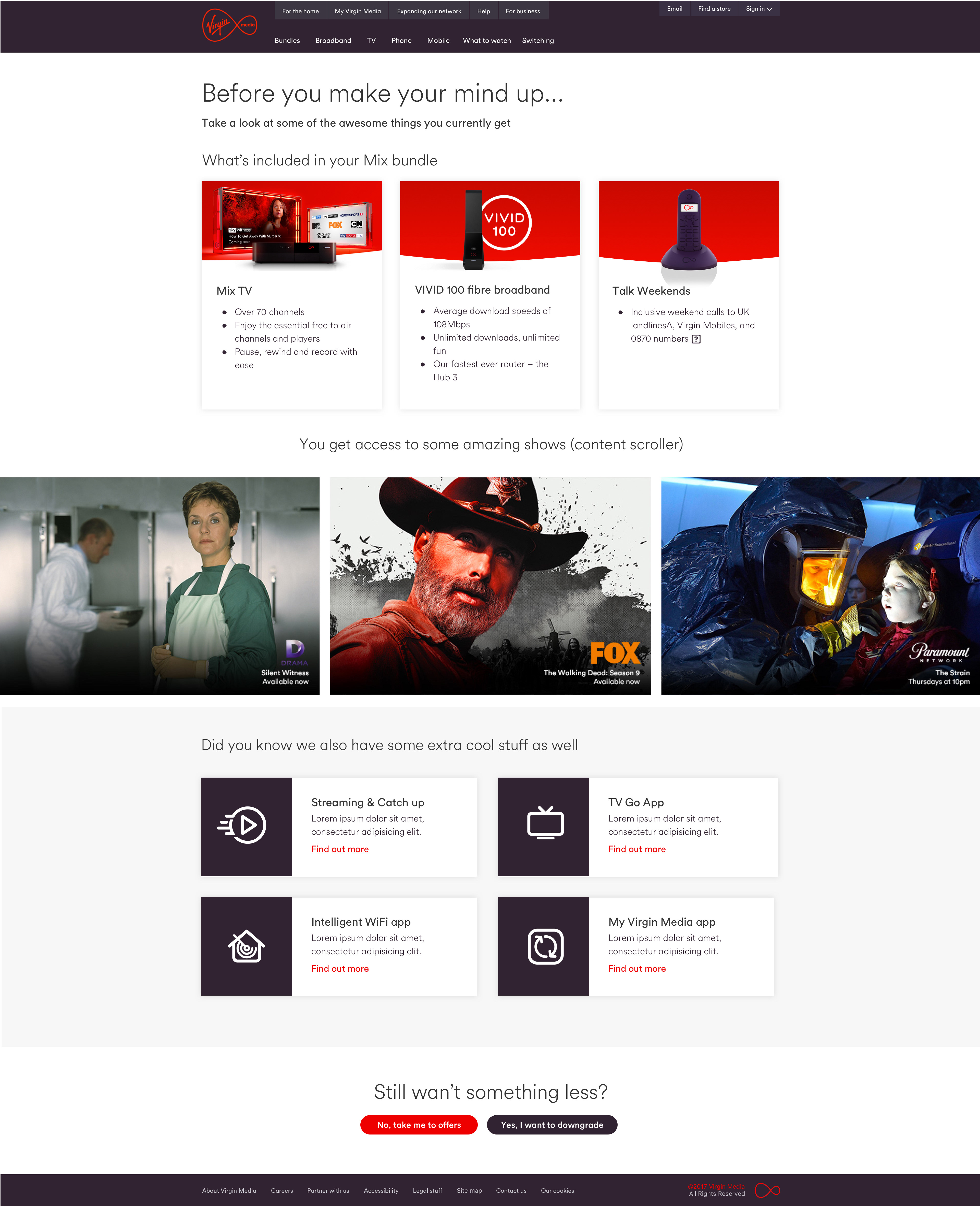
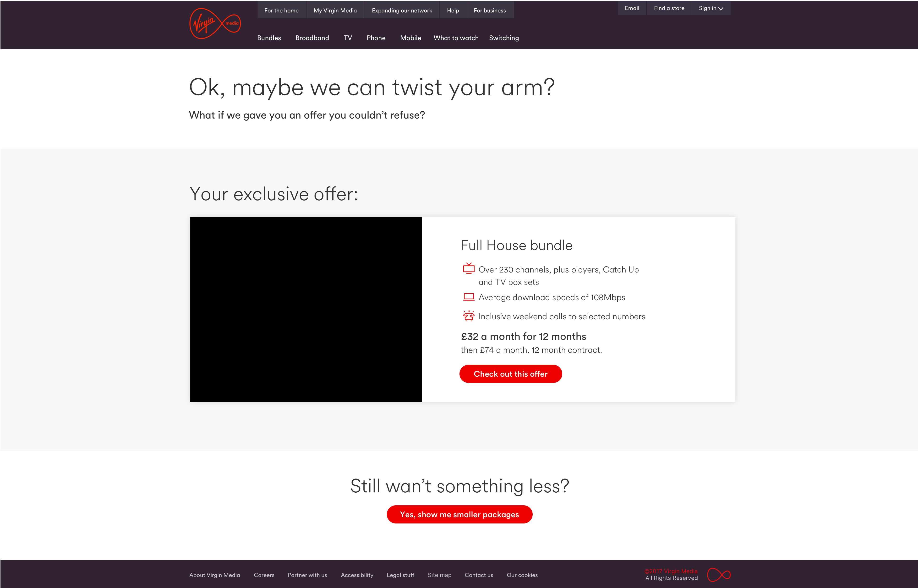
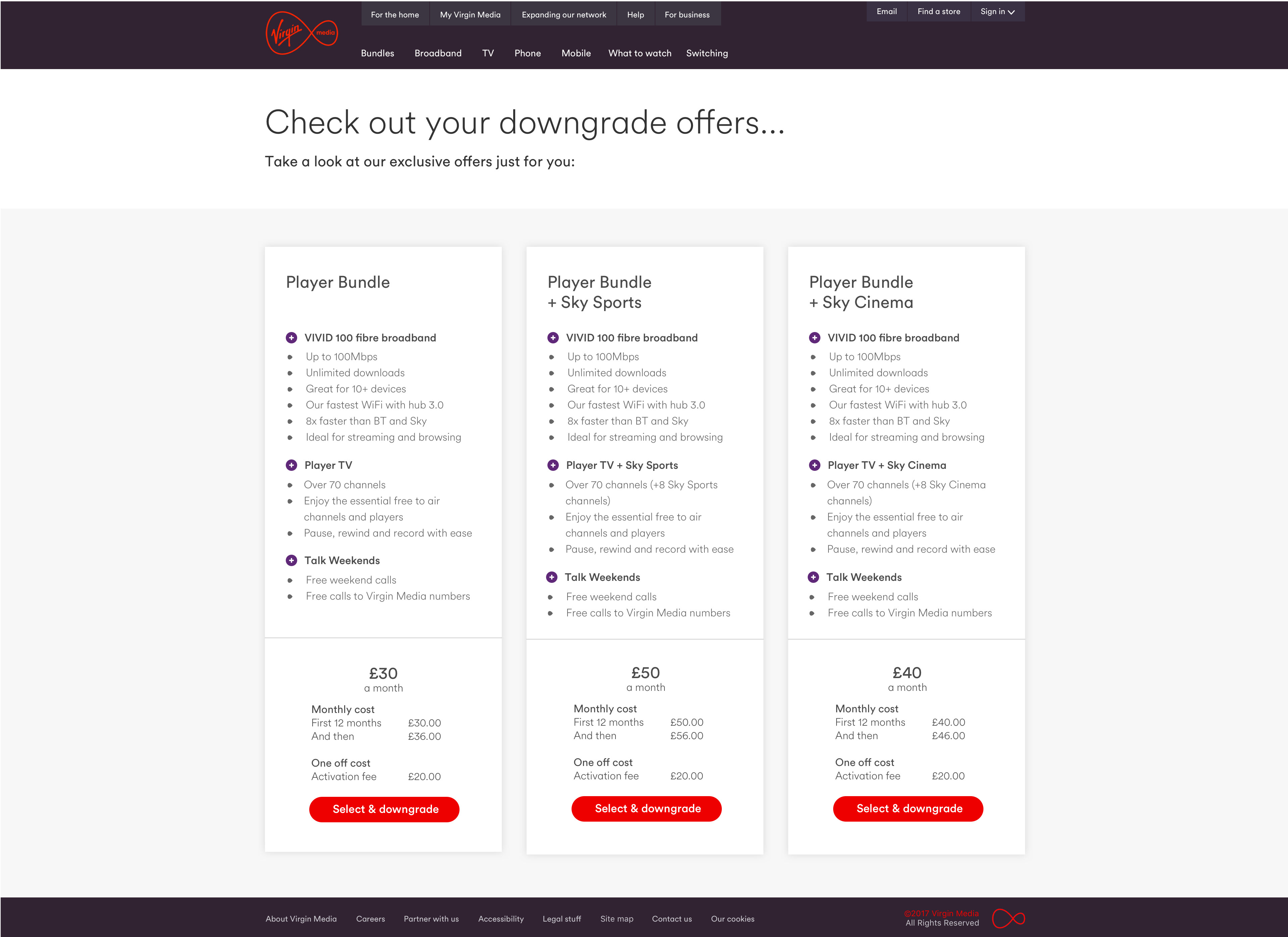
This project supported Virgin Media’s digital transformation by shifting the downgrade process from call centers to a seamless online journey. I helped design an experience that made it easier for users while surfacing tailored offers and alternatives. Through user interviews and A/B testing, we optimized for both customer ease and business KPIs. Feedback was strong—users found it less stressful, quicker, and were more open to alternative offers.

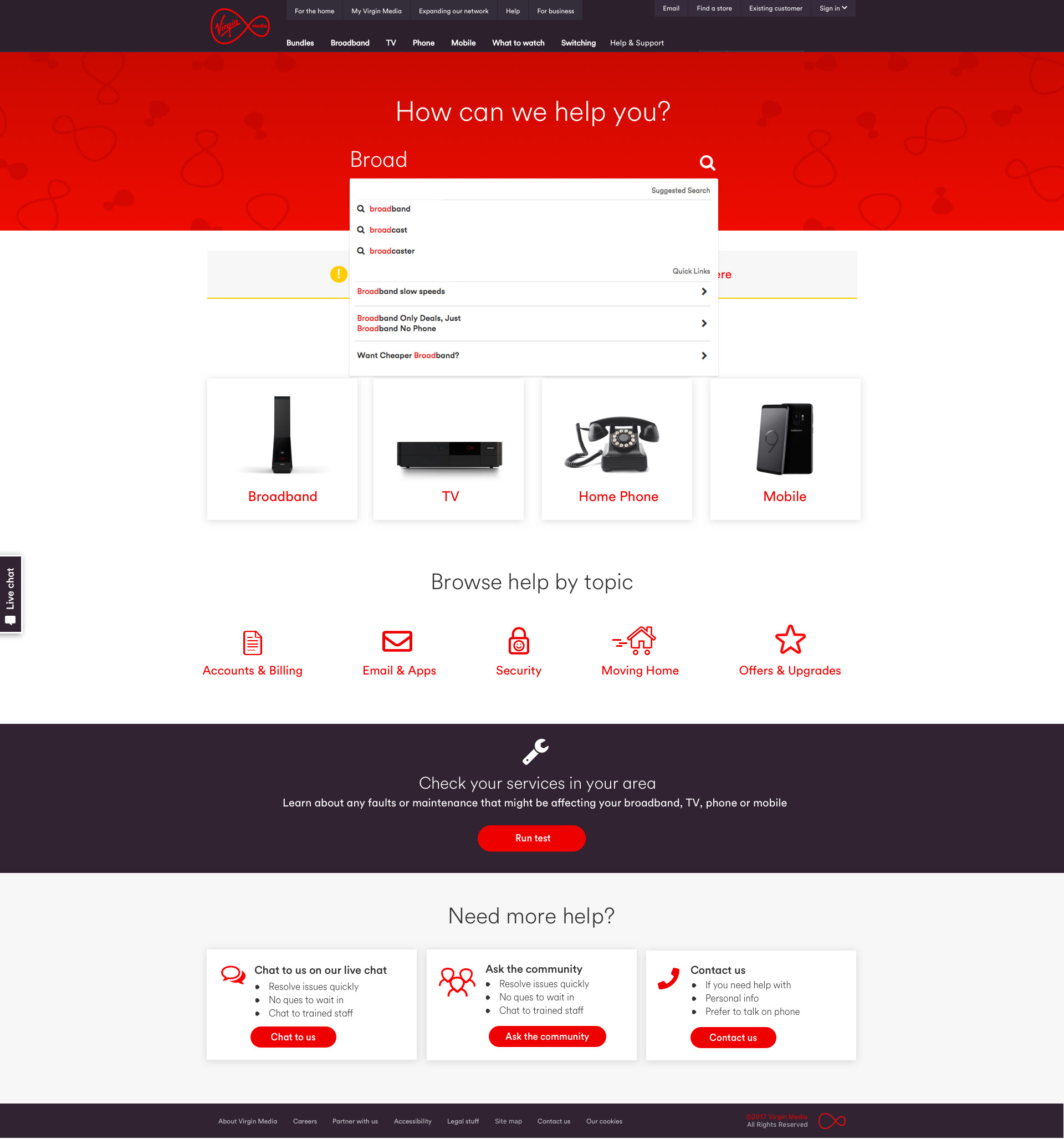
Help Hub
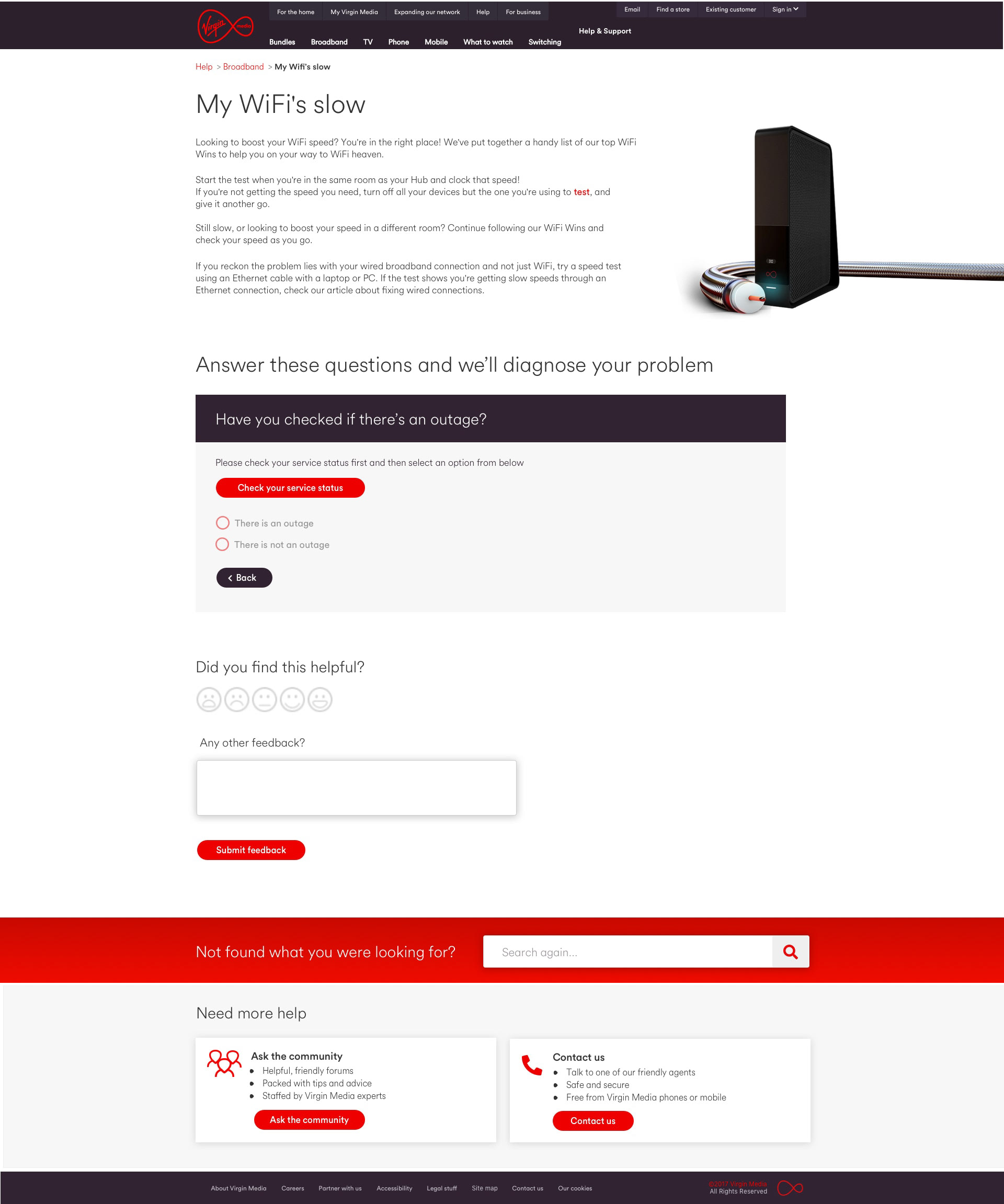
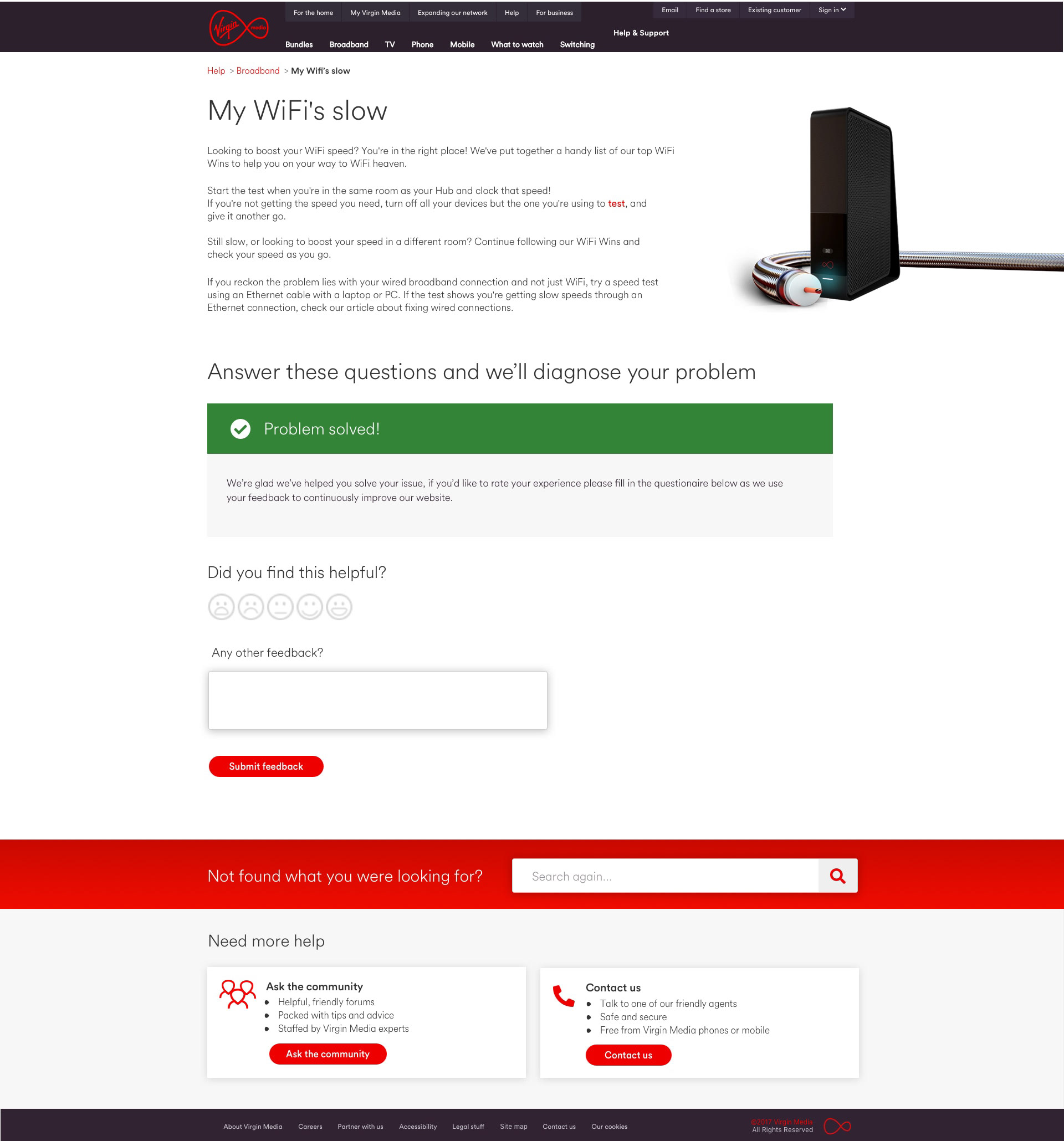
This project focused on redesigning the Help Centre to encourage self-service through clearer articles and step-by-step guidance. Using analytics and user insights, we improved search and signposting, and revamped components like the chatbot and step-by-step flows to make content easier to follow. Research showed users found the old articles overwhelming, so the new approach aimed to simplify and reduce reliance on the help desk.
Help Hub Homepage

Step by Step guides


Personalisation
During my time at Virgin Media I worked on multiple initiatives around personalisation and providing the right information at the right time to our users. I worked on a mix of projects from service level messaging to personlised offers, here are a few of my favourites.
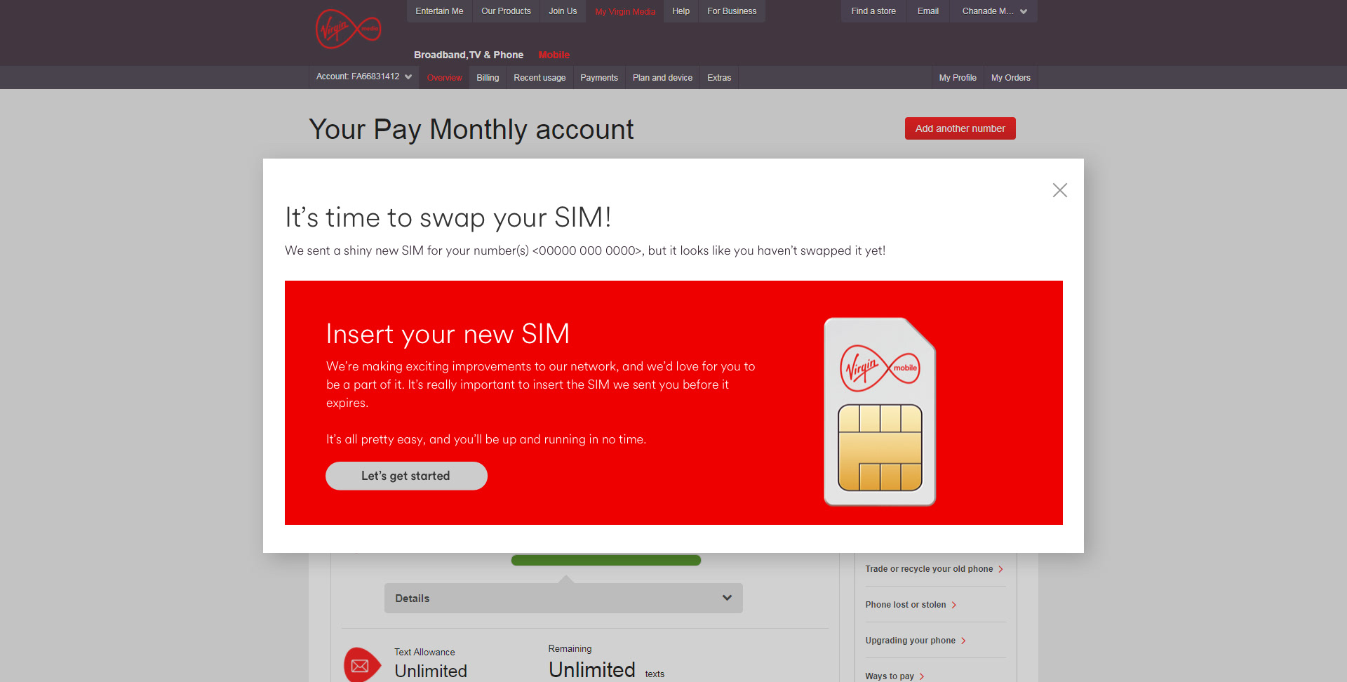
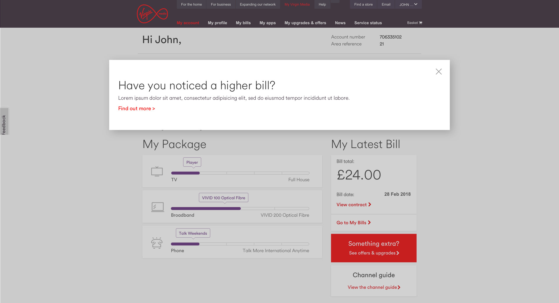
Personalised Service Alerts
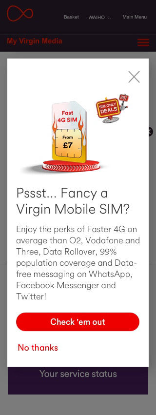
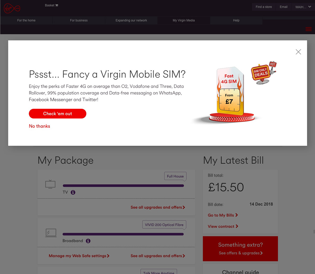
Using customer lifecycle/journey data we knew that some users were confused at vital points in their customer cycle wether that be at the start of their contract when receiving their first bill or for our mobile users when it came time to swap out a Virgin Sim Card etc.
We worked with the customer teams to understand the data and based on what we knew about each user prompt them inside of their account when we knew they might get to a point of frustration.



Personalised Offers
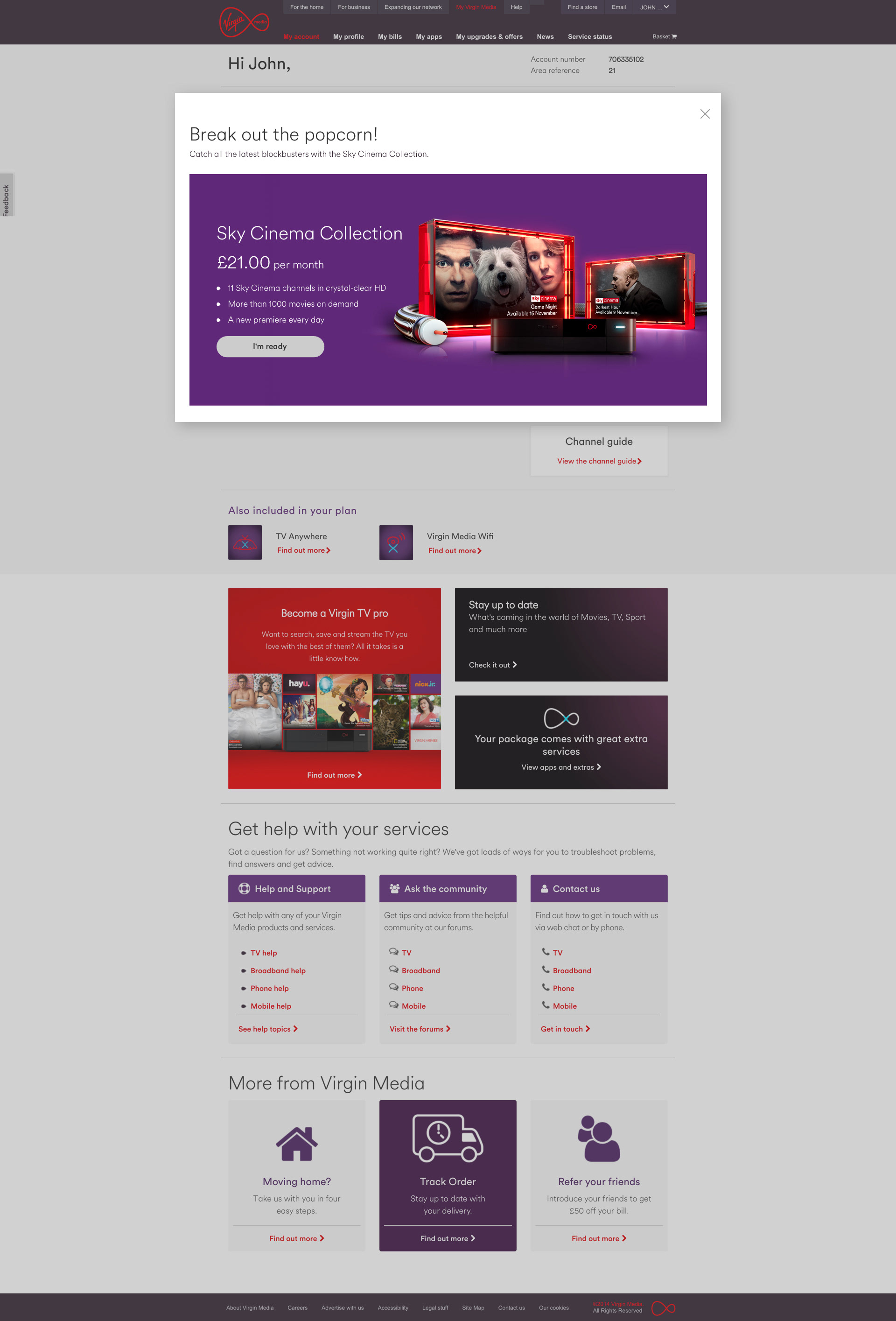
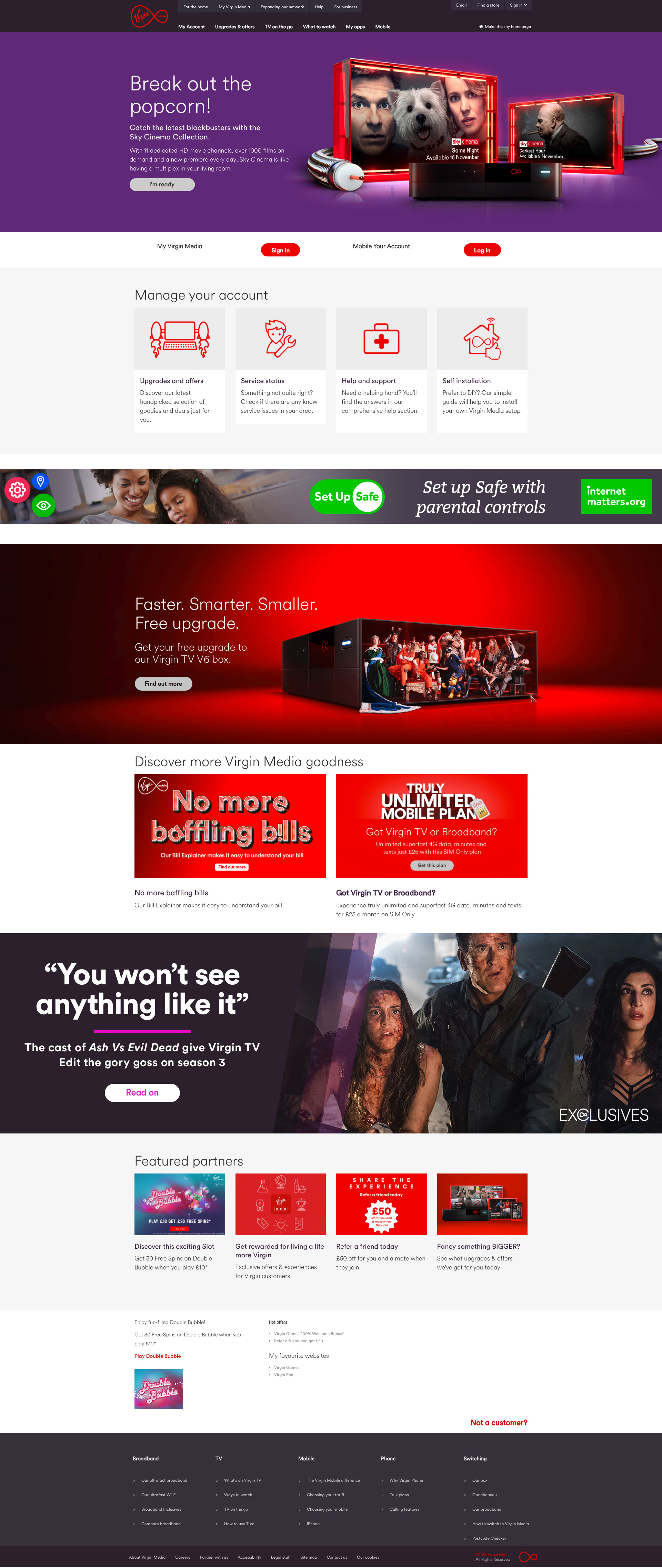
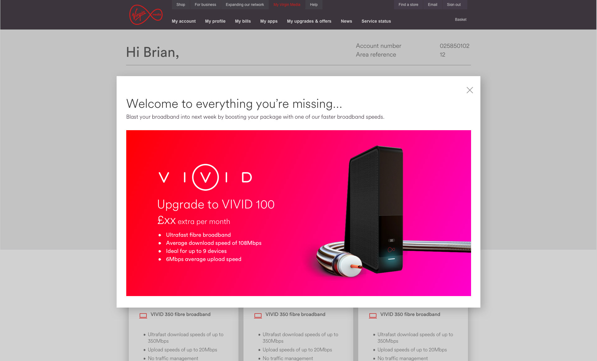
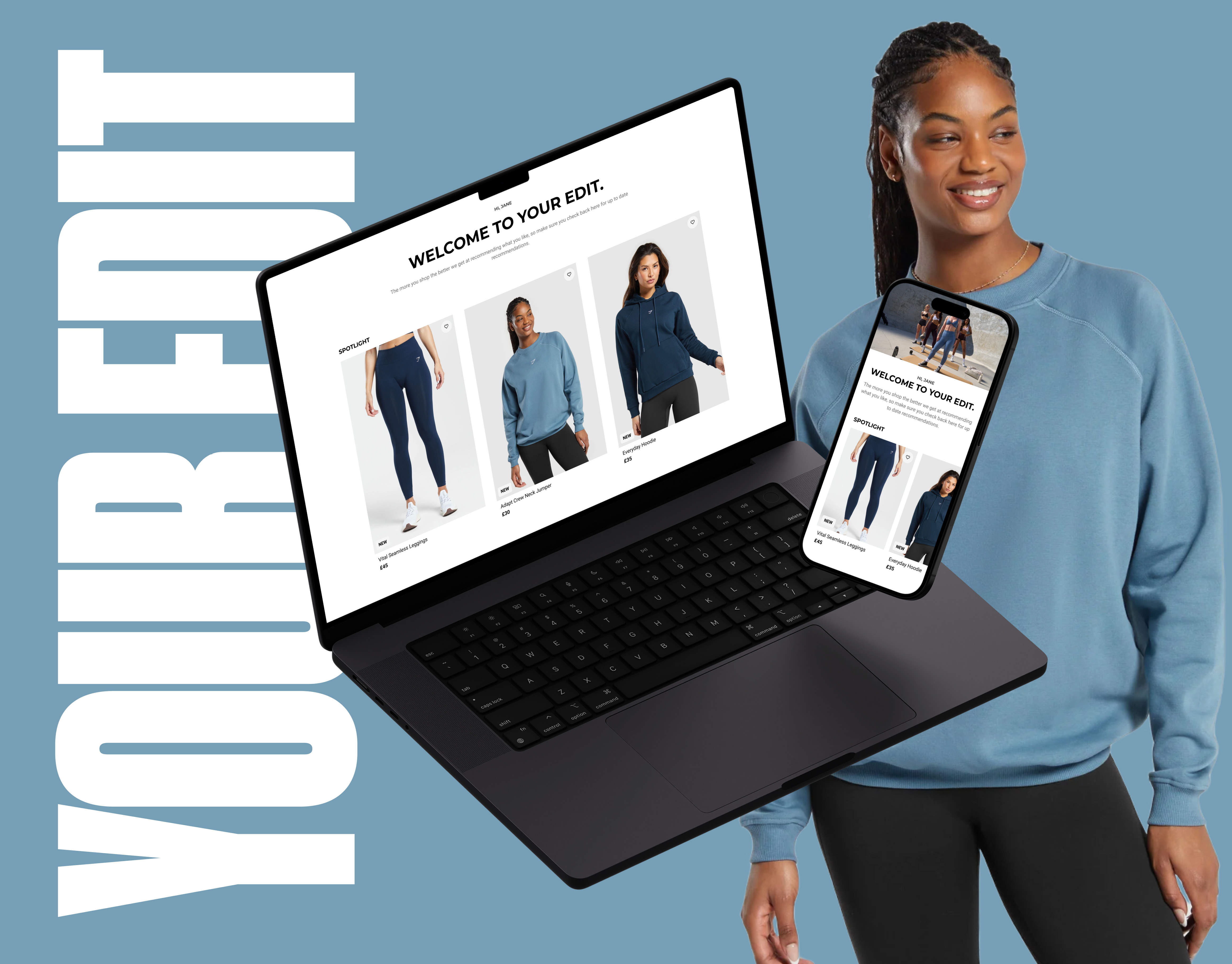
Using customer data, we timed and tailored offers based on viewing habits and recent activity—like suggesting Sky Sports to F1 fans or prompting upgrades after set-top box use. As Creative Lead, I shaped the UX copy to ensure messaging felt helpful, not intrusive, working closely with brand teams. Targeting over a million users, we saw a 64% conversion lift and a small boost in NPS and experience scores.

