A new and improved dedicated education section on the Gymshark Product Page.
Problem Statement
Despite strong product design and high‑quality materials, users struggled to understand why a product was right for them once they landed on the Product Detail Page.
The original PDP had several core issues:
Lack of clarity on product intent
While descriptions existed, they were hidden inside a modal that few users opened. This meant shoppers often didn’t understand what the product was designed to do, leading to hesitation and drop‑off.
While descriptions existed, they were hidden inside a modal that few users opened. This meant shoppers often didn’t understand what the product was designed to do, leading to hesitation and drop‑off.
Hidden Material Benefits
Technologies like sweat‑wicking or seamless construction weren’t surfaced clearly, reducing perceived value.
Technologies like sweat‑wicking or seamless construction weren’t surfaced clearly, reducing perceived value.
Weak Visual Support for Product Fit
Without motion or context, it was hard for customers to imagine how the product performed during real activities.
Without motion or context, it was hard for customers to imagine how the product performed during real activities.
No Hierarchy Across Content Types
Designed intent, description, features, and sizing lacked structure, making the PDP feel fragmented and inconsistent.
Designed intent, description, features, and sizing lacked structure, making the PDP feel fragmented and inconsistent.
The result: uncertainty, lower confidence, and reduced conversions
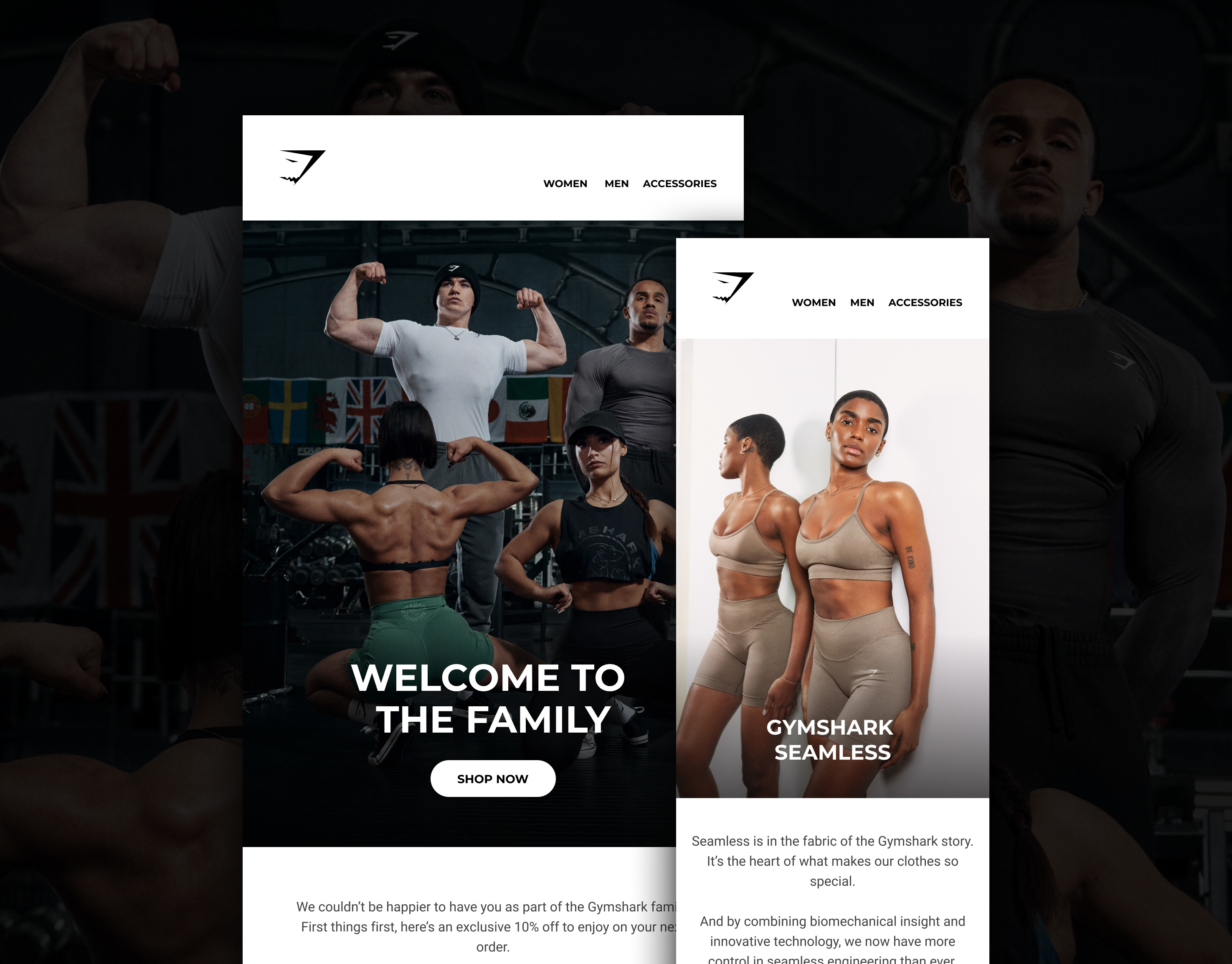
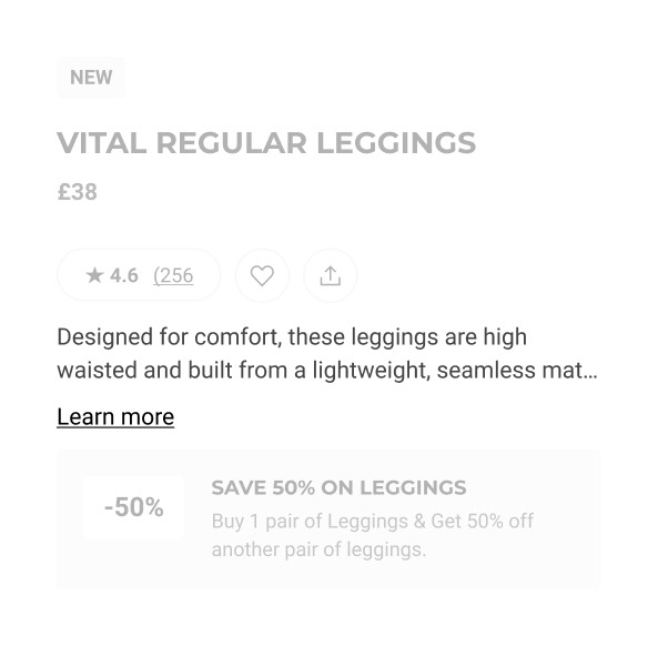
Old PDP Description
What we did.
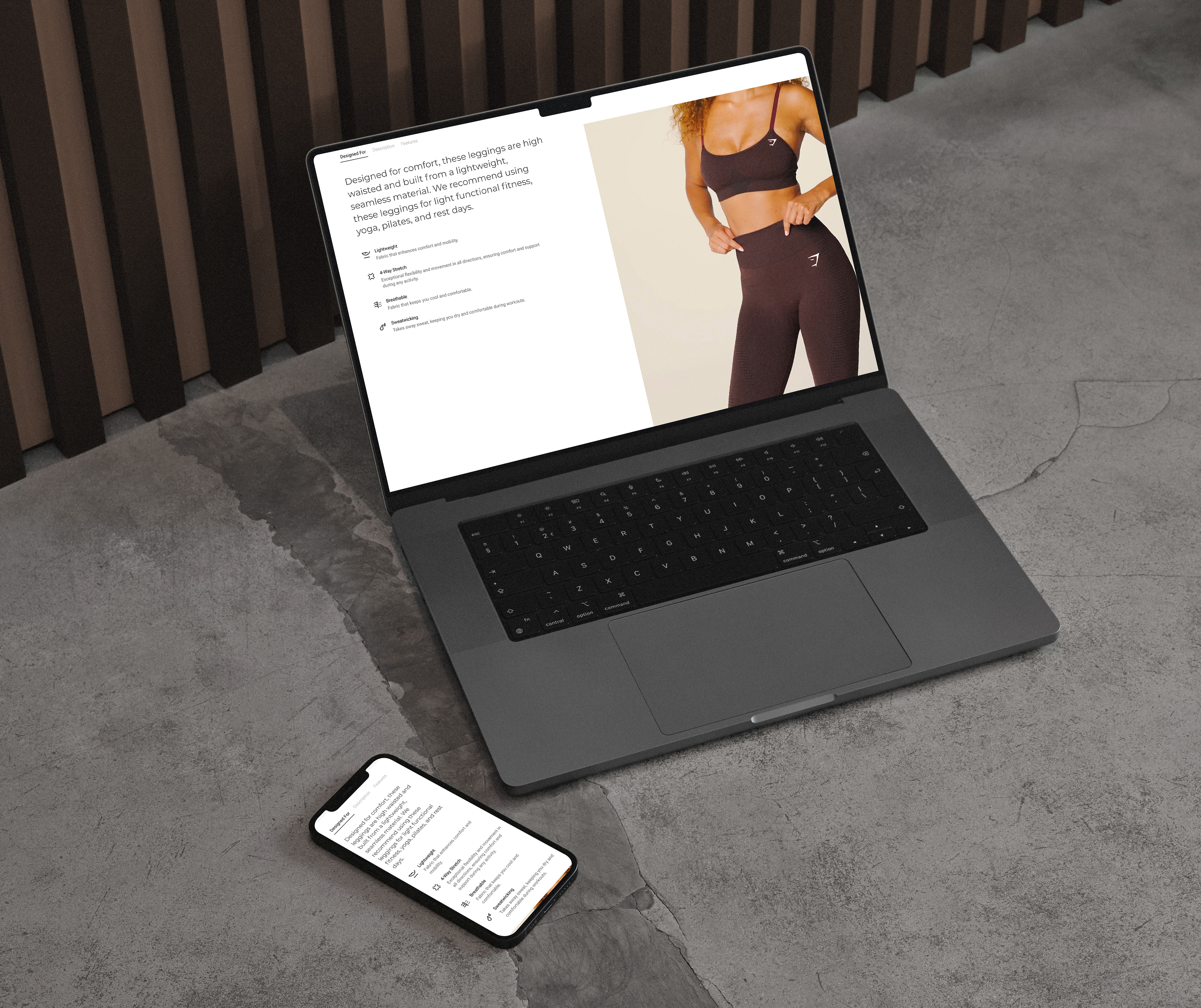
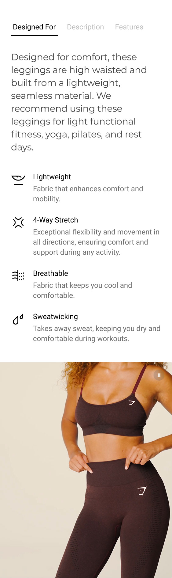
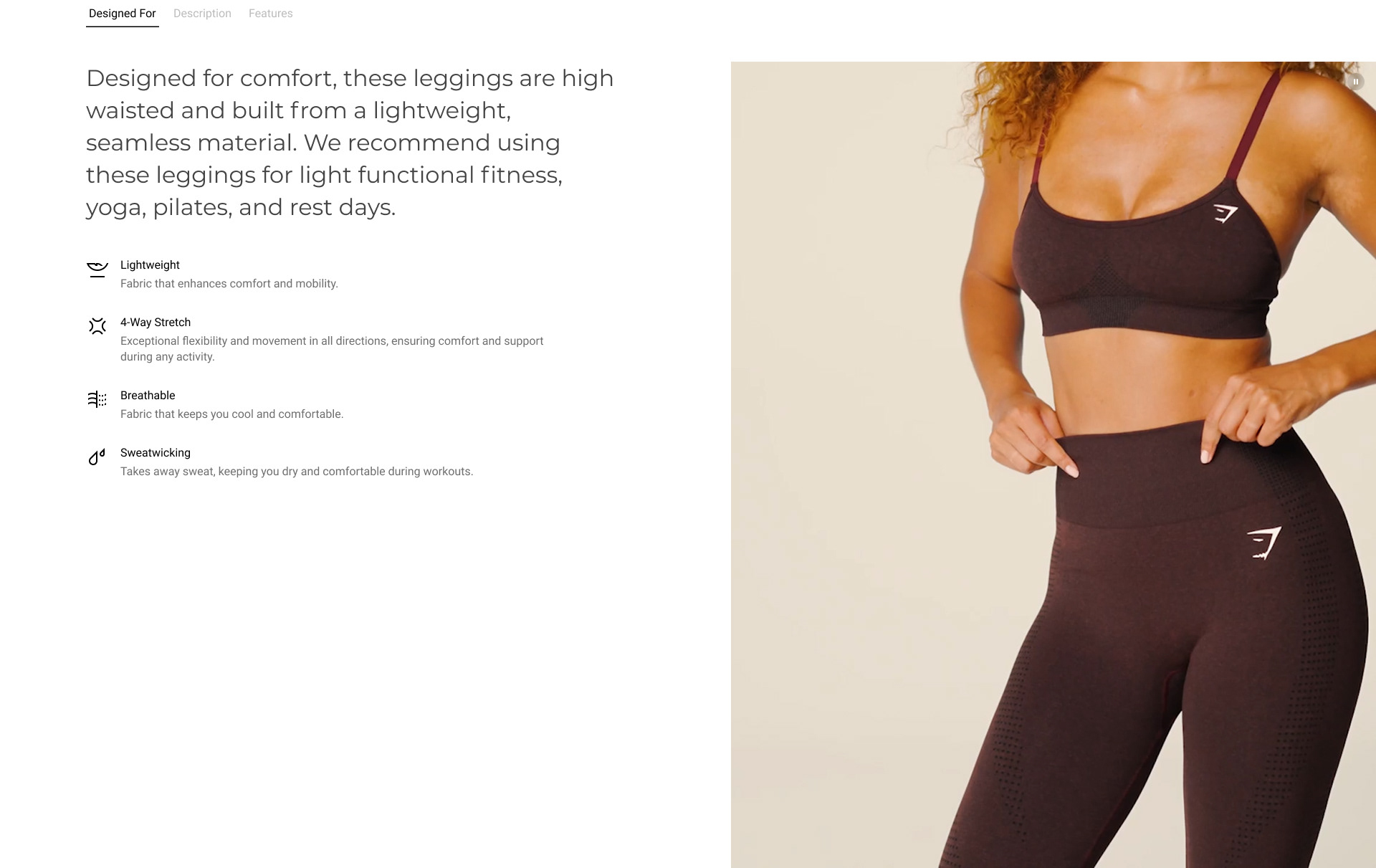
1. “Designed For” Anchor Preview
To help users immediately understand why a product exists, we introduced a short “Designed For” preview high up on the PDP info section.
Impact:
Increases engagement by giving users a clear, scannable reason to explore more.
Increases engagement by giving users a clear, scannable reason to explore more.
Design Detail:
A concise preview sentence appears above the fold.
Tapping it smoothly anchors users down to the full “Designed For” content section.
Builds an intentional narrative: “Here’s what this is, here’s why it's great for you.”
A concise preview sentence appears above the fold.
Tapping it smoothly anchors users down to the full “Designed For” content section.
Builds an intentional narrative: “Here’s what this is, here’s why it's great for you.”
Designed for Paragraph
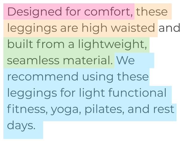
We rewrote and restructured the product intent narrative using a pre‑defined, user‑validated content model. Each paragraph clearly communicates:
- USP / Design intent (pink)
- Product fit (yellow)
- Material properties (green)
- Recommended activities (blue)
Impact:
Users reported far clearer understanding of purpose, fit, and benefits in UXR testing.
Users reported far clearer understanding of purpose, fit, and benefits in UXR testing.
Design Detail:
Conversational but direct tone.
High‑scannability structure that matches mental models.
Supporting bullet points and iconography for tech callouts (e.g., Breathable, Lightweight, Sweat‑Wicking).
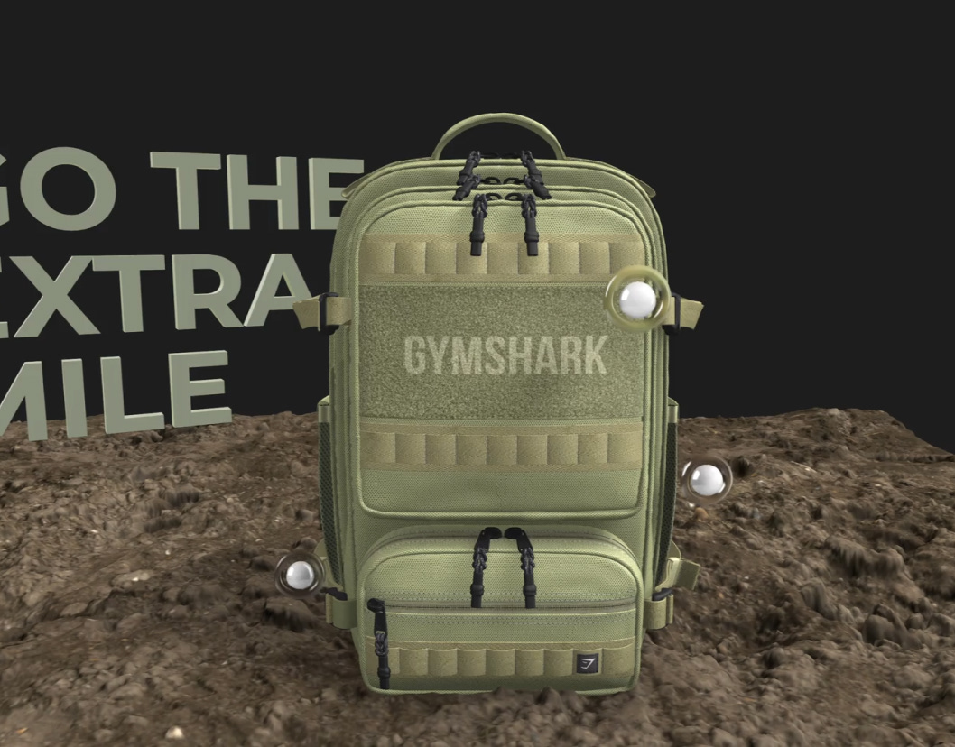
A motion-led product video showcasing the garment in real movement so users can see drape, stretch, and comfort.
Conversational but direct tone.
High‑scannability structure that matches mental models.
Supporting bullet points and iconography for tech callouts (e.g., Breathable, Lightweight, Sweat‑Wicking).
A motion-led product video showcasing the garment in real movement so users can see drape, stretch, and comfort.
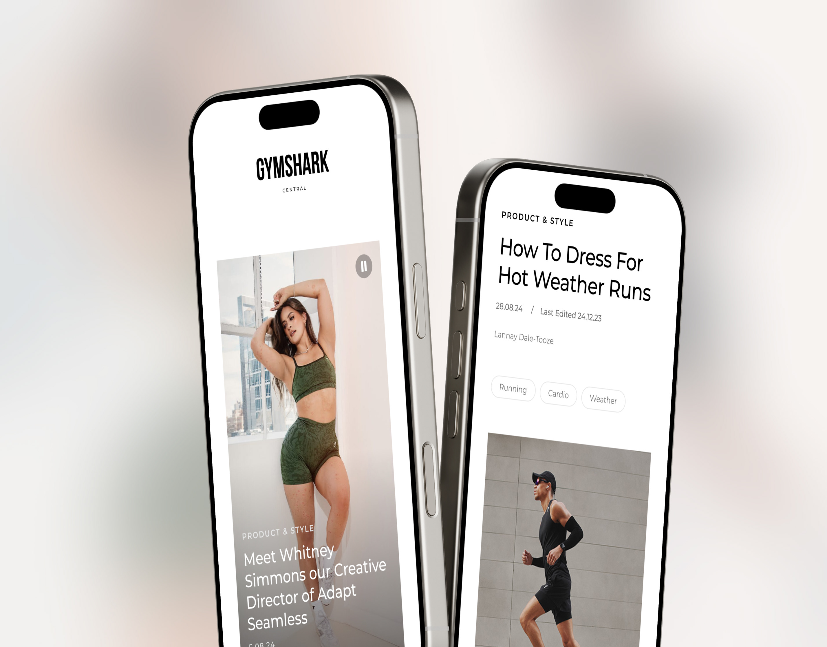
Motion Led Video Example
Footage in which the model is performing an activity is recommended. Or footage of how the garment falls, rises or stretches was preferred by users in UXR.
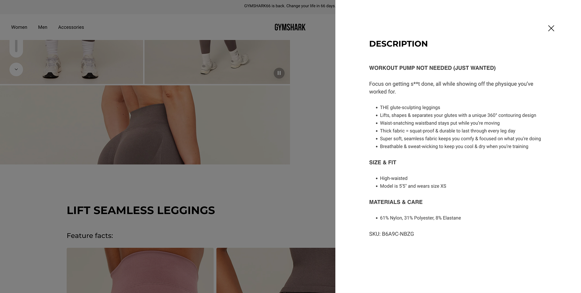
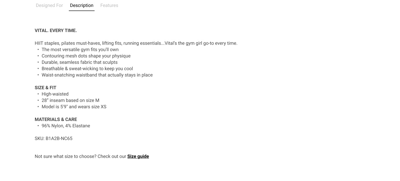
Description Enhancements
We kept the existing Shopify description but improved the experience around it.
Impact:
Greater readability and a clearer separation between marketing copy and functional detail.
Greater readability and a clearer separation between marketing copy and functional detail.
Design Detail:
Moved this from a separate accordion higher up the page into this section to create one main “product education” area on the PDP.
Increased font size + improved spacing for better scan patterns.
Added a dedicated Size Guide link beneath the description.
Moved this from a separate accordion higher up the page into this section to create one main “product education” area on the PDP.
Increased font size + improved spacing for better scan patterns.
Added a dedicated Size Guide link beneath the description.
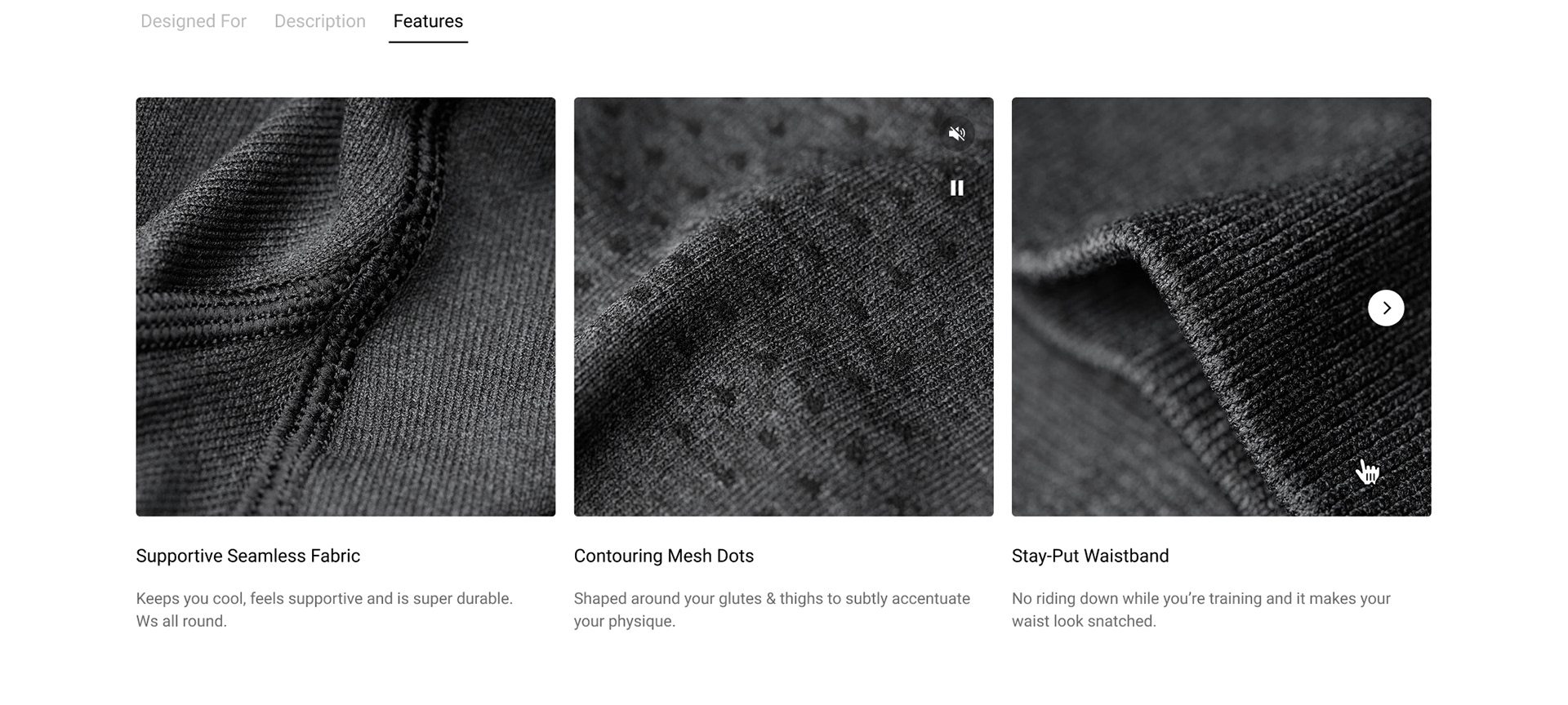
Product Features Section
A newly envisioned, visual-first features module gives users a richer understanding of the product’s functional and emotional benefits.
Impact:
Customers connect more deeply to the product’s value proposition.
Customers connect more deeply to the product’s value proposition.
Design Detail:
High-quality macro images paired with concise copy.
Designed to complement the technical material attributes in the Designed For Tab, expanding the story from “what it’s made of” to “how it makes you feel.”
Modular, scalable, and consistent across product categories.
High-quality macro images paired with concise copy.
Designed to complement the technical material attributes in the Designed For Tab, expanding the story from “what it’s made of” to “how it makes you feel.”
Modular, scalable, and consistent across product categories.
User Research Feedback
"I like that it gives you options of different kinds of training that you can do with that, and I like that there's a video included as well”
🇺🇸 Jenny, USA
🇺🇸 Jenny, USA
"I really like that (the video) actually, because sometimes the pictures are not enough to see how it looks like or how it performs”
🇬🇧 Maisy, UK
🇬🇧 Maisy, UK
(speaking about the section they would look at first) "This section, Designed For... It's giving me an idea of what I can use it for”
🇺🇸 Rebecca, USA
🇺🇸 Rebecca, USA
"It's broken down well and it's easily digestible. There's no massive paragraphs of what the material is or what it's useful for, it's just straight to the point, which most people want”
🇬🇧 Kim, UK
🇬🇧 Kim, UK
"It definitely gives enough information, I would say it's much more than I see in pages from other brands”
🇺🇸 Sam, USA
🇺🇸 Sam, USA
(talking about materials and care section) "It tells you what not to do so 'Don't tumble dry', pretty self-explanatory and I would say it's very informative, it's easy to find”
🇬🇧 Hannah, UK
🇬🇧 Hannah, UK
Summary
The redesigned PDP helps users answer the essential purchase questions:
Is this product right for me?
How will it fit me?
What can I actually use it for?
Why is it worth the price?
By structuring content around real user needs and surfacing the information that matters most, the PDP now delivers a far more intuitive, confidence‑building e‑commerce experience.