I was the Product Design lead on this project working with multiple other designers to create new and improved journeys to go along with moving the Gymshark Shopify stores to a new headless environment.
Ensuring the designs were fully validated with users I worked with business stakeholders from ideation to build, making sure all KPIs were tackled with each new feature & journey.
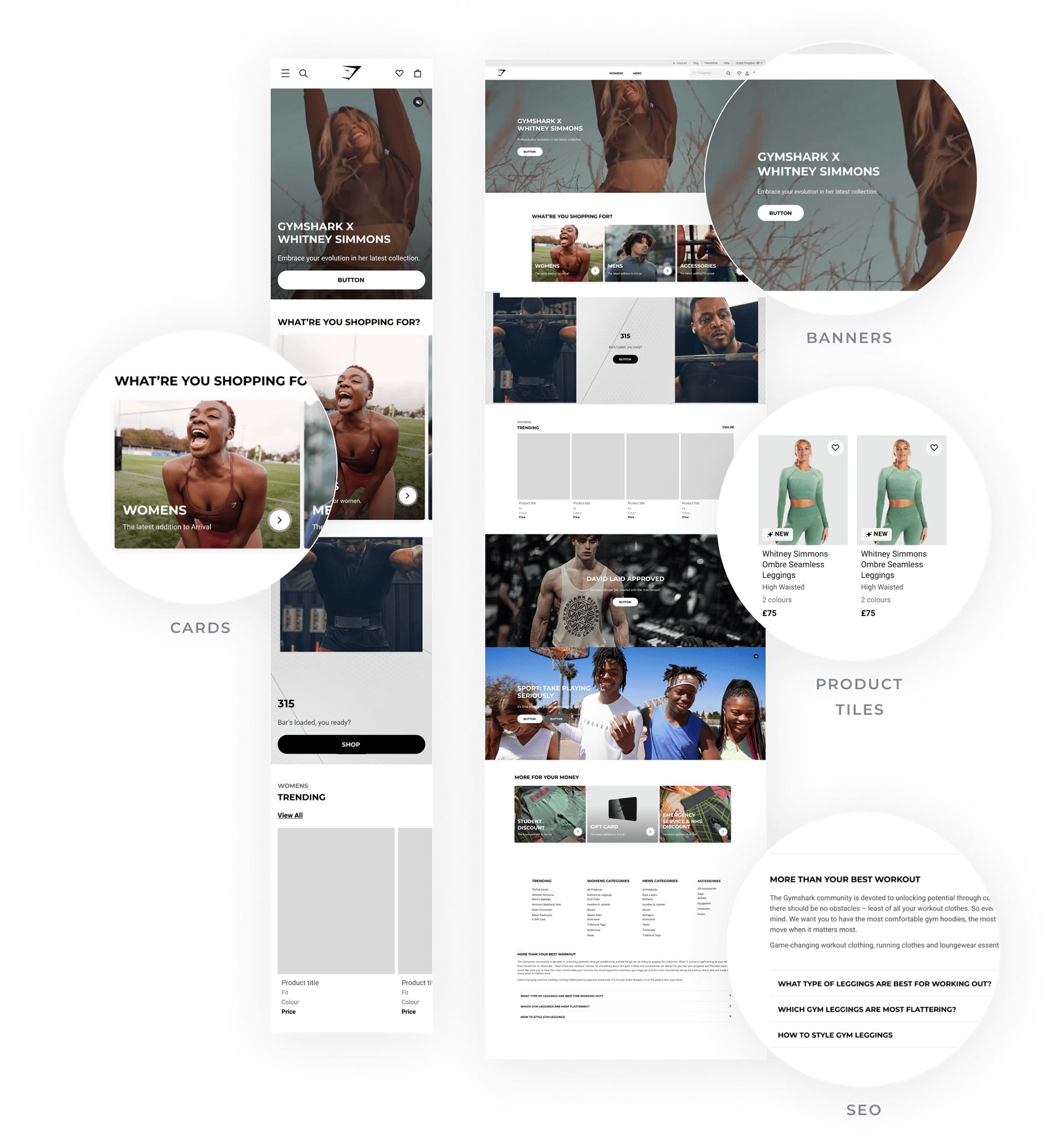
Homepage
A dynamic and exciting homepage, encompassing richer components.
New features
- Hero banners including new text positioning options.
- More advanced Hero cards supporting imagery and video media.
- SEO content tailored to enhance our ranking.
- New product rails including our new product tiles.
- More advanced Hero cards supporting imagery and video media.
- SEO content tailored to enhance our ranking.
- New product rails including our new product tiles.
Objective
To create an exciting, on-brand homepage using a selection of robust pre-defined components and ensuring the Ecom team had more control over managing the homepage & bringing it in line with the app. Another objective was to increase the performance of the page from an SEO point of view, distributing link authority.
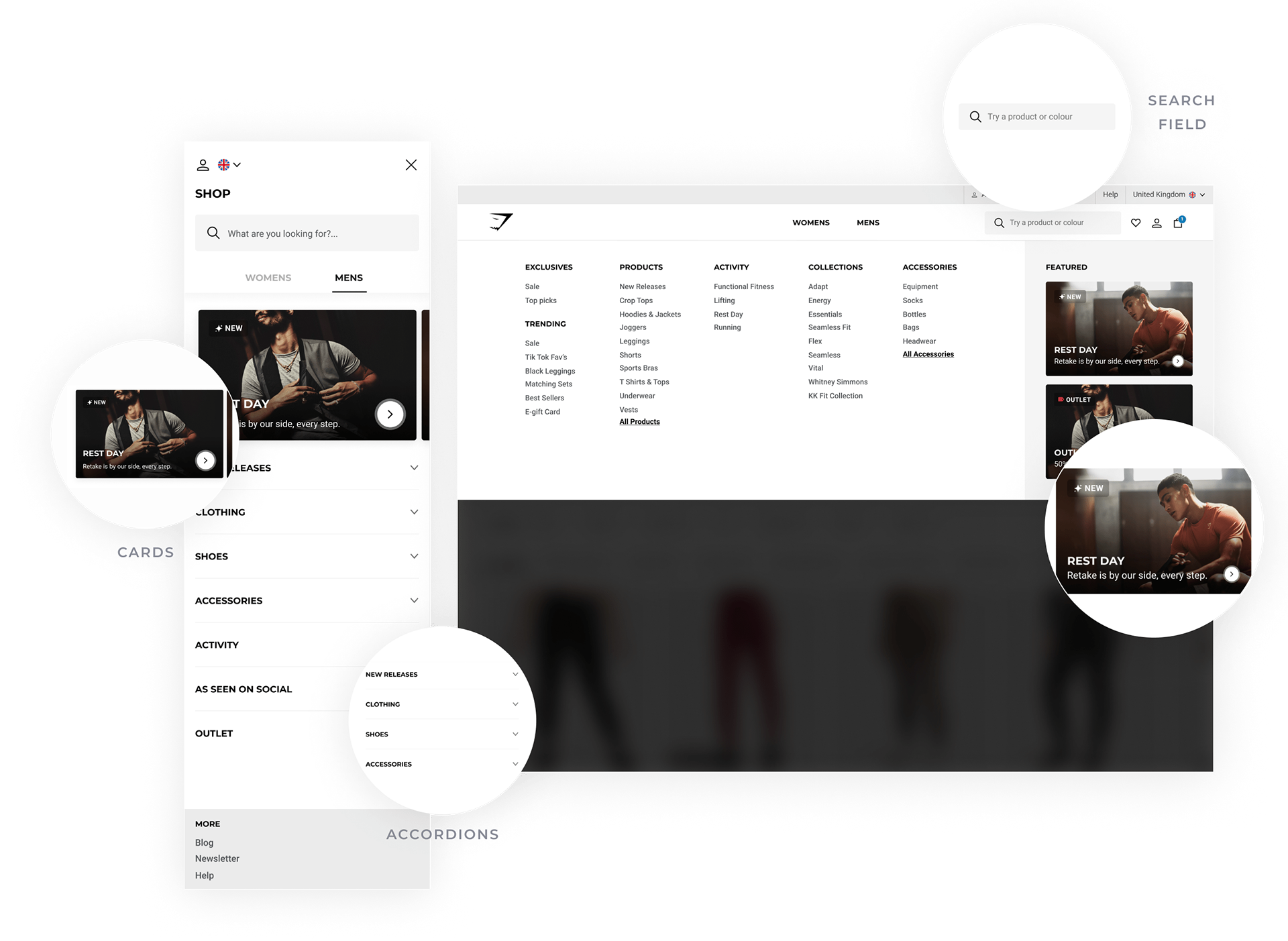
Navigation
A more user-friendly navigation experience.
New features
The new Navigation includes big improvements to mobile as well as some smaller quality-of-life improvements on desktop.
- New Search field UI added to the navigation
- More advanced Hero cards that support image and video media types.
- Dropdowns to support multiple-page links on mobile
- New language selector
- More advanced Hero cards that support image and video media types.
- Dropdowns to support multiple-page links on mobile
- New language selector
Objective
Design a new and improved mobile navigation experience enabling users to browse more effectively and encouraging users to search from the navigation experience. As well as improve the current merchandising block UI so it stands out more to users.
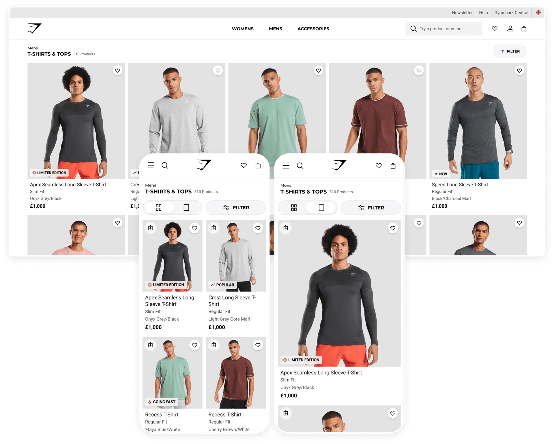
Collection Pages
Increase click-through from collection pages to product pages by allowing our products to stand out more and reduce noise whilst promoting key product details.
New features
- Removed the image header due to no increase in conversion
- Reduced the page title size so that the Products take priority
- Moved the subcategories into the filter for a cleaner look. User feedback and data suggested moving these was the right thing to do.
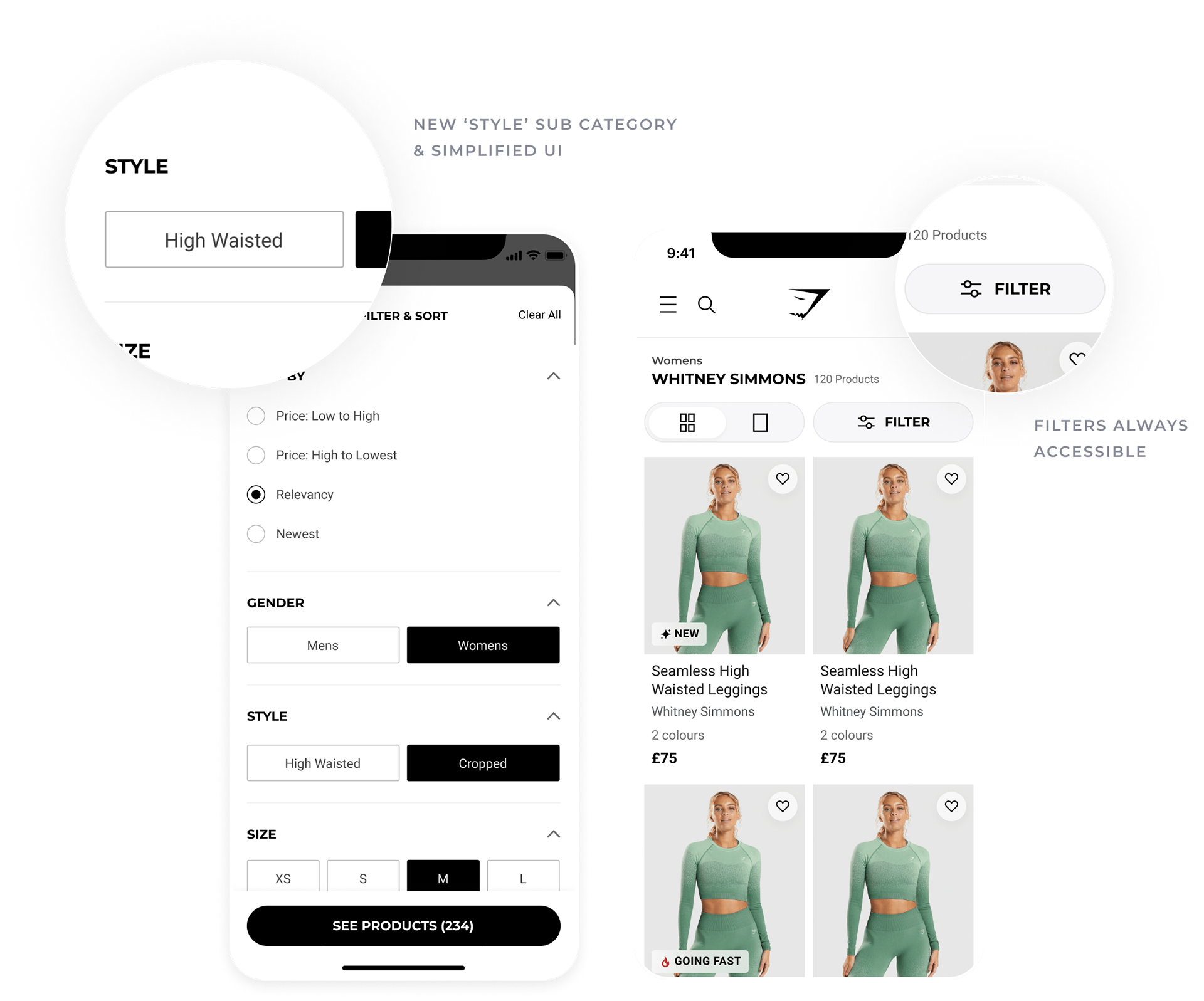
- Sub-categories are renamed to be more friendly and are now called ‘styles’. This also helps define what content should go in this particular filter category.
- Reduced the page title size so that the Products take priority
- Moved the subcategories into the filter for a cleaner look. User feedback and data suggested moving these was the right thing to do.
- Sub-categories are renamed to be more friendly and are now called ‘styles’. This also helps define what content should go in this particular filter category.
Objective
Users who filter are more likely to add to their cart vs those who don't. So we wanted to improve the experience of filtering and encourage more users to filter their results.

Product Filtering
New filtering experience helping users find the specific products they need
New features
- Simplified list UI, making it easier for the customer to make a choice.
- Filter now opens in a temporary view on desktop & mobile cleaning up the collection pages and focusing the user on the choices they are making
- Filter button is now sticky and always on the screen as the user scrolls
- Filter view is now much larger on mobile allowing users to see more options.
- Introduction of sub-categories into the filter from the page. Now called ‘Styles’
Objective
To allow users to find what they're looking for in the fastest most seamless way possible.

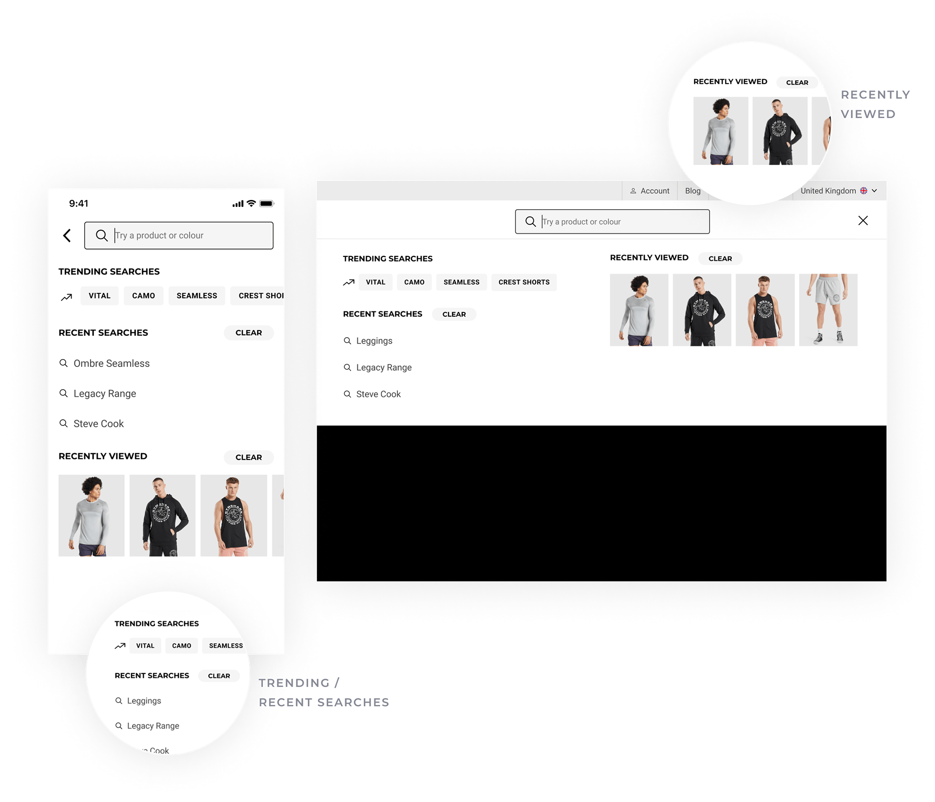
Search
Much improved search experience including new features that allow users to find things faster.
New features
- Trending searches
- Recent searches
- Recently viewed
- Advanced filtering
-Search suggestions
- Search results pages
- Recent searches
- Recently viewed
- Advanced filtering
-Search suggestions
- Search results pages
Objective
Users who search are the most valuable, however, only a small amount of users currently search on the website. We wanted to improve the discoverability of search and enhance the experience of searching on the website.

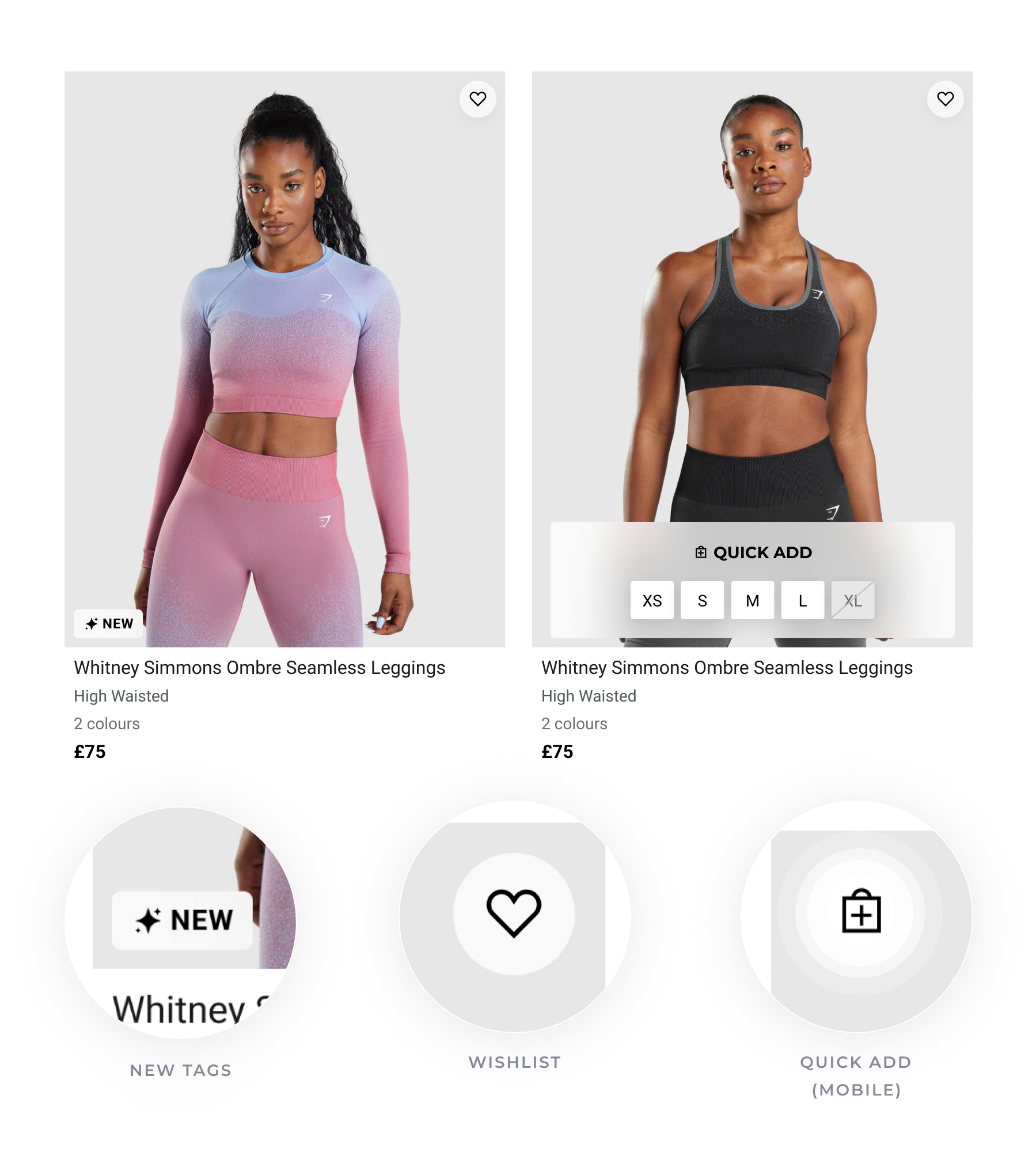
Product Cards
Increase Collection page to Product page conversion by improving quality and refining the detail presented on our product cards.
New features
- Updated the UI of our tags and positioned them on top of the image to create more space below.
- Added the product "Fit" below the product name
- Removed the colour name and added the number of colours available on that product in line with user testing insight.
- Removed the decimal from pricing when (.00) to clean up the UI
- Added the product "Fit" below the product name
- Removed the colour name and added the number of colours available on that product in line with user testing insight.
- Removed the decimal from pricing when (.00) to clean up the UI
Objective
To enable a consistent and improved hierarchy of information and allow for better differentiation between products & enable users to see more tags, which should better merchandise products.

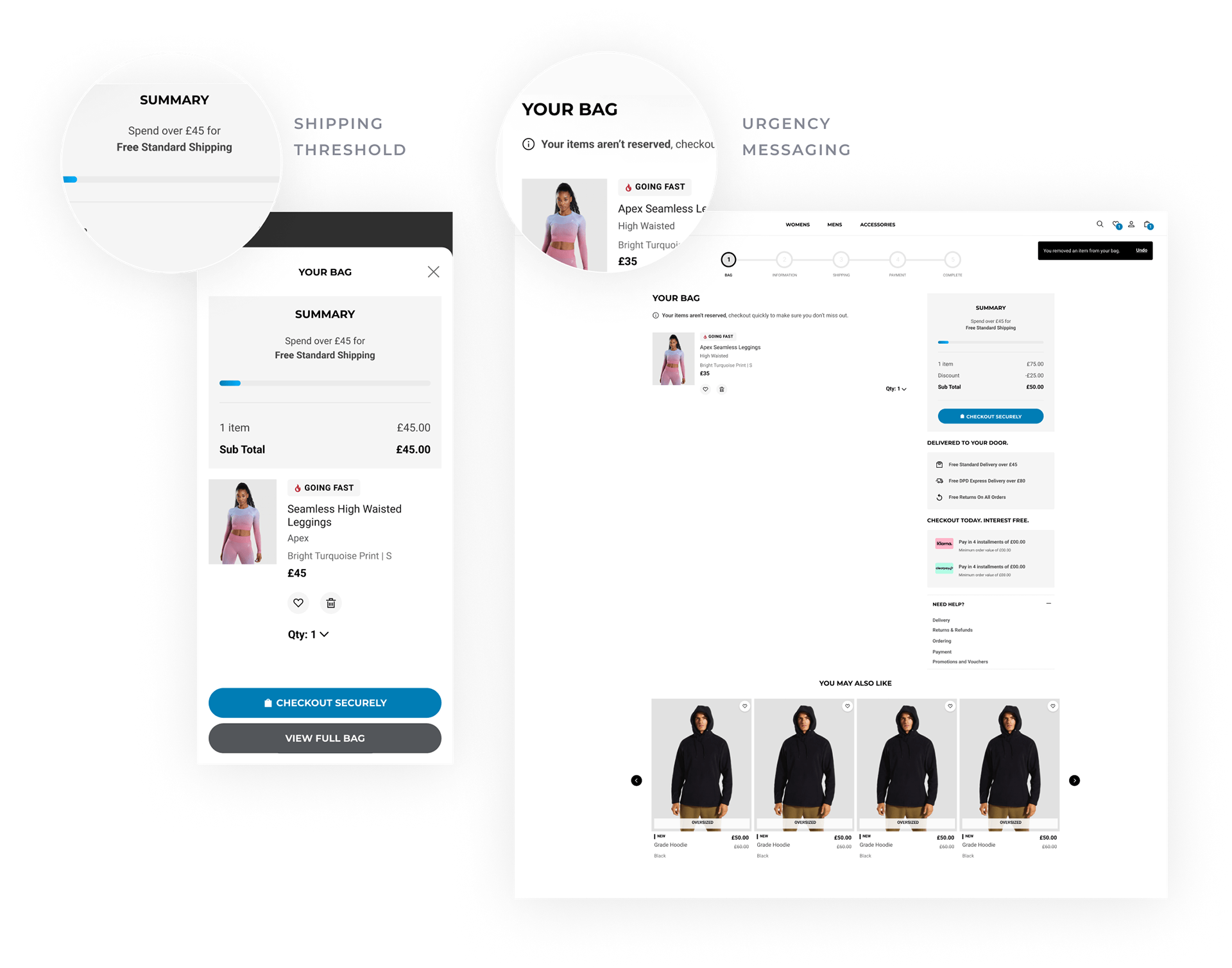
Cart/Minicart
Allowing the customer to better manage their cart while improving average order value using delivery thresholds.
New features
- Addition of shipping thresholds to help increase average order value
- New clearer Product card UI and tags
- Stock reservation urgency messaging
- Addition of Delivery, Payment & Help information
- New clearer Product card UI and tags
- Stock reservation urgency messaging
- Addition of Delivery, Payment & Help information
Objective
Enable users to manage their carts better, giving them easier-to-use UI controls and allowing them to see how far away they are from their shipping thresholds.

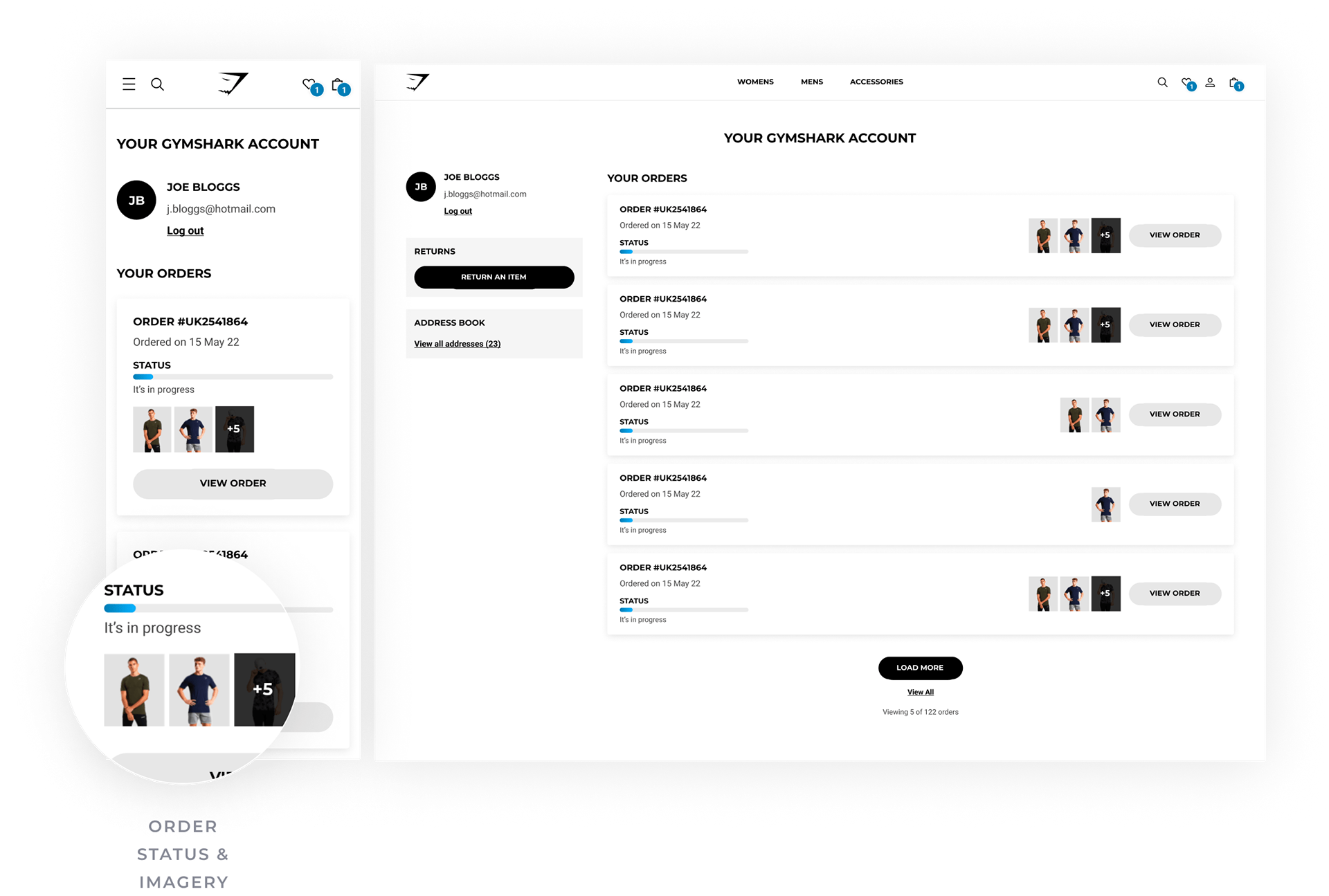
Account
A huge refresh for accounts, enabling users to see important information and bringing the UI up to date.
New features
- New order card UI to help users find and manage their orders
- Addition of a profile icon
- Clear order status indicators for each order
- More detailed order information page
- Product imagery added to better visually represent each order
- UI brought in line with the GS app
- Addition of a profile icon
- Clear order status indicators for each order
- More detailed order information page
- Product imagery added to better visually represent each order
- UI brought in line with the GS app
Objective
Improve the UI to enable users to easily see and manage their orders.
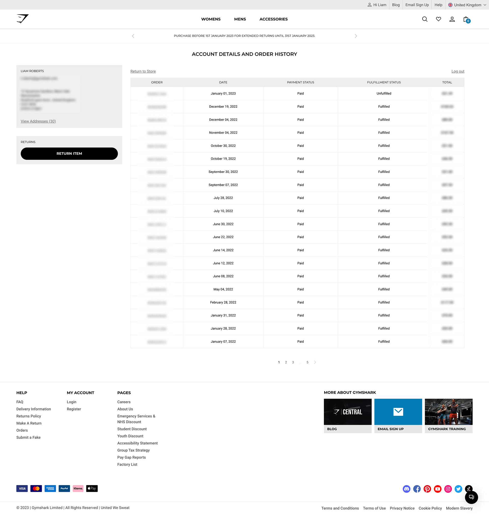
Old account page
Outdated layout, unhelpful information, lack of order status awareness, and generally not inspiring or on brand.
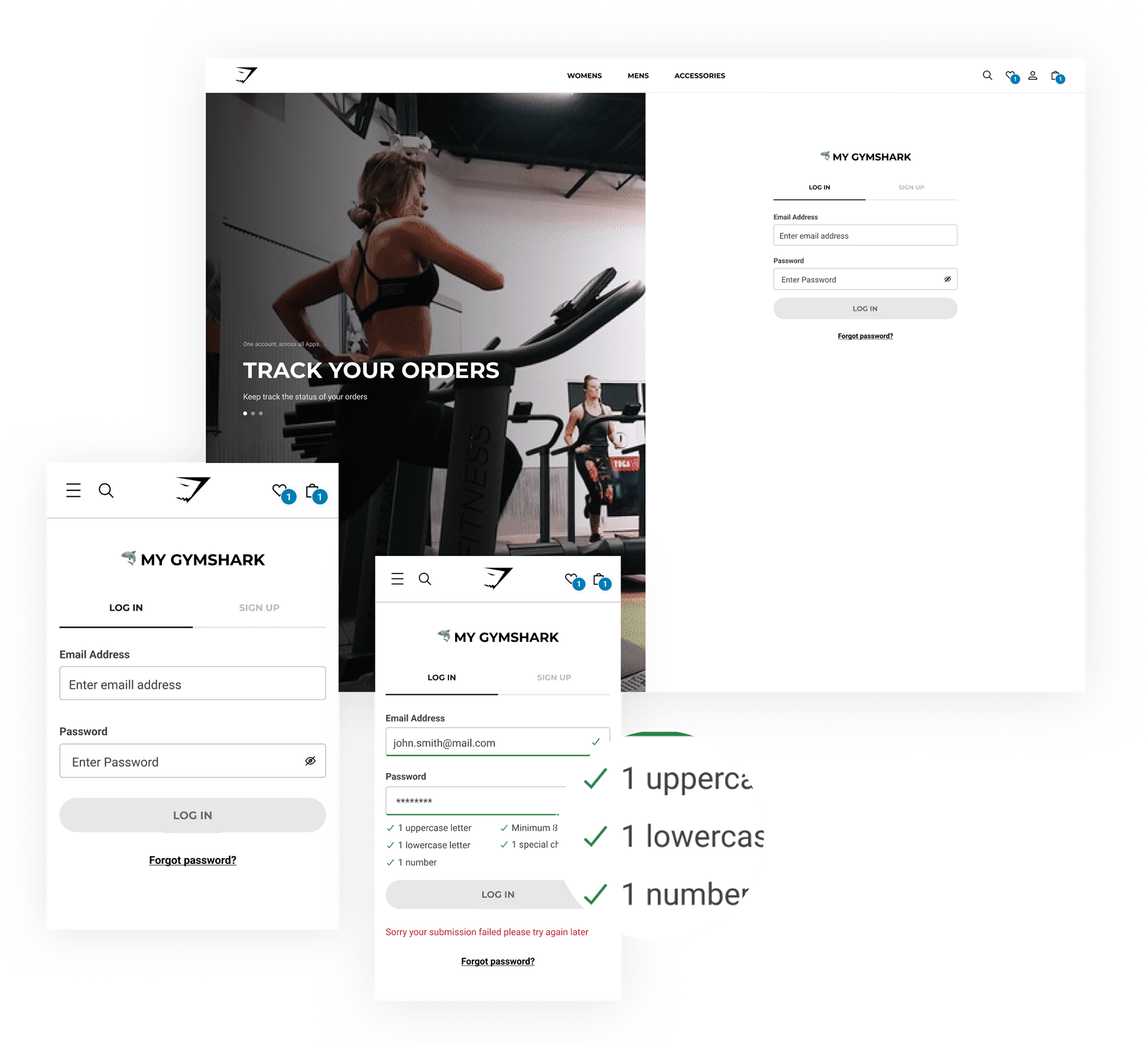
Sign up / Log in
A new sign-up / sign-in experience with improved form validation and a simpler overall journey.
New features
- Tabs to quickly switch between logging in or signing up
- On desktop devices, we will show a carousel of account benefits enticing users to both sign-in and sign-up.
- Improved form field validation
- On desktop devices, we will show a carousel of account benefits enticing users to both sign-in and sign-up.
- Improved form field validation
Objective
Laying the groundwork for a new onboarding experience as well as future account features.

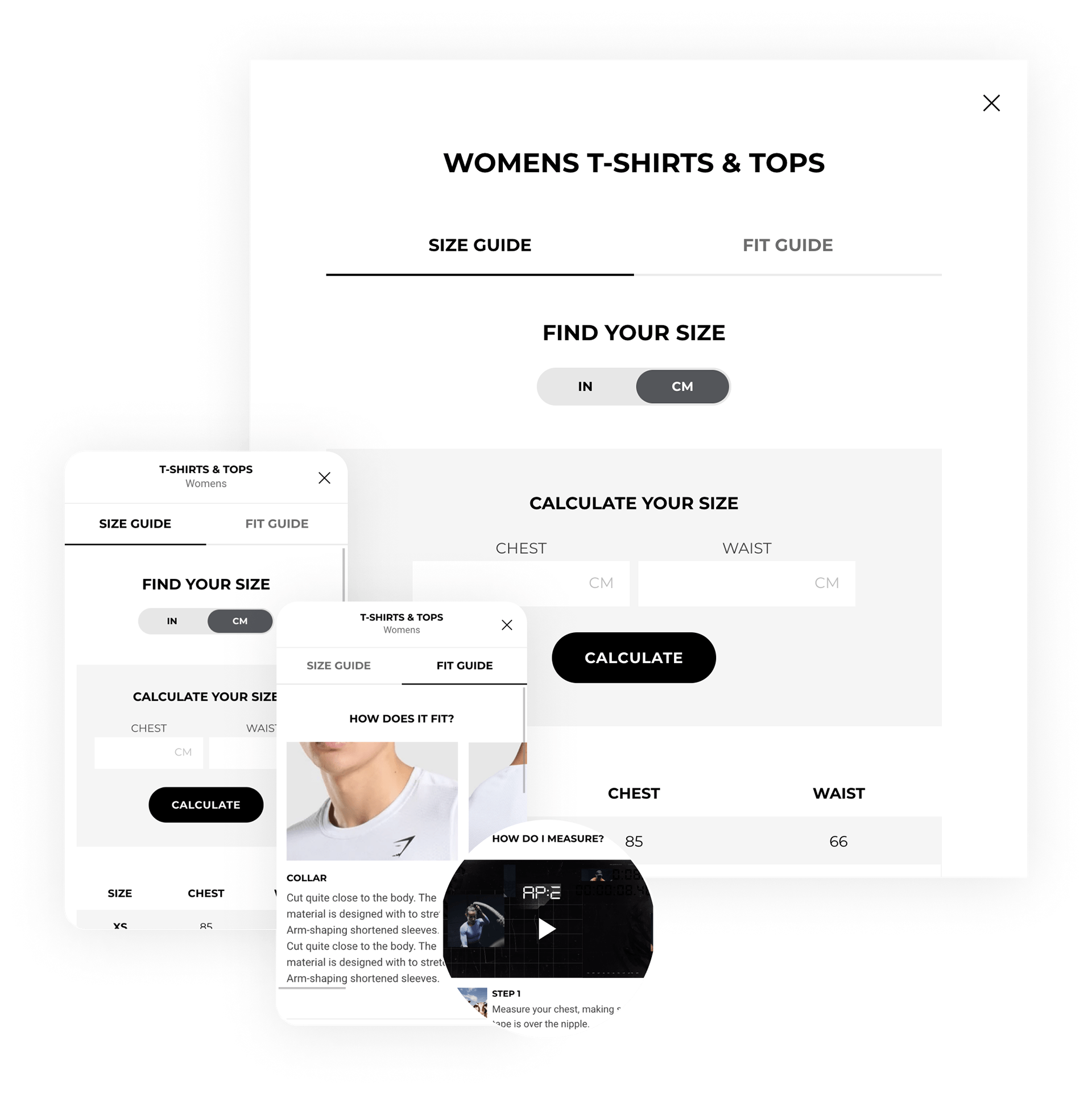
Size Guides
A new more informative size guide including a size calculator & educational size & clothing fit content
New features
- Ability to switch between size guide and fit guide information
- New calculator functionality to better calculate the right size based on body measurements
- More fit information and rich media to show how to measure properly
- New calculator functionality to better calculate the right size based on body measurements
- More fit information and rich media to show how to measure properly
Objective
Create a more useful size guide for the user, allowing them to calculate their size easier and educate them on our sizing and fits.