Pitch for Google’s new Stadia cloud-based gaming platform, for this project I created personas, user flows, wireframes, UI patterns, interaction animations and video banners.
This project showcases how I would approach designing a multi-device user interface that is flexible enough to scale where necessary to create a linear consistent experience across all devices, giving the user freedom to play their way.
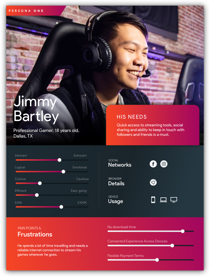
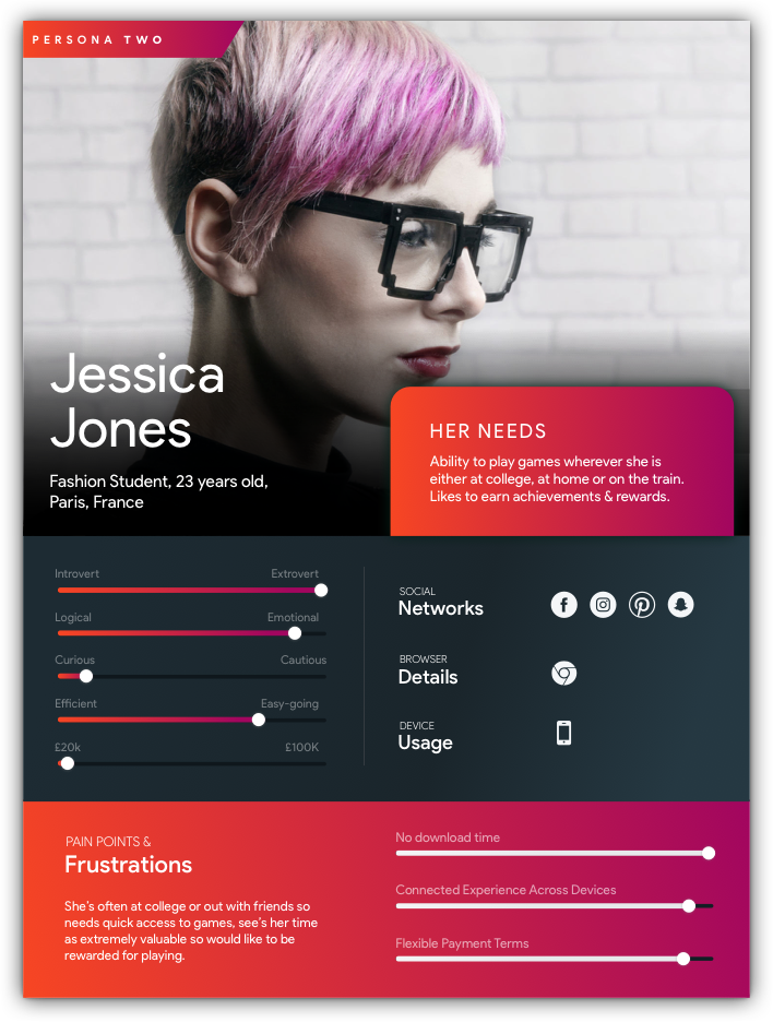
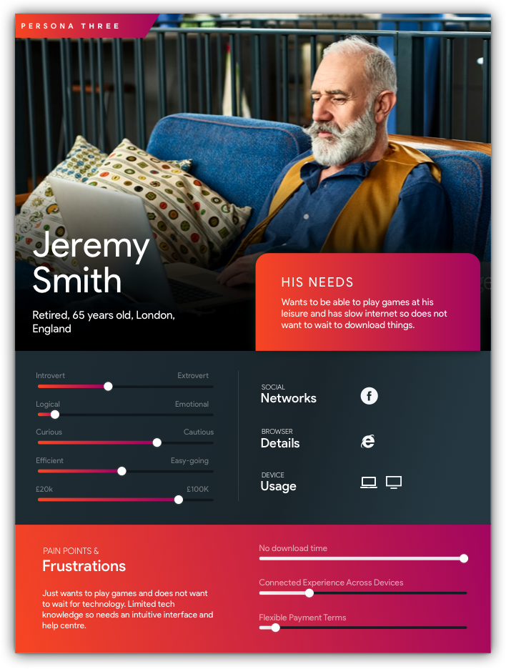
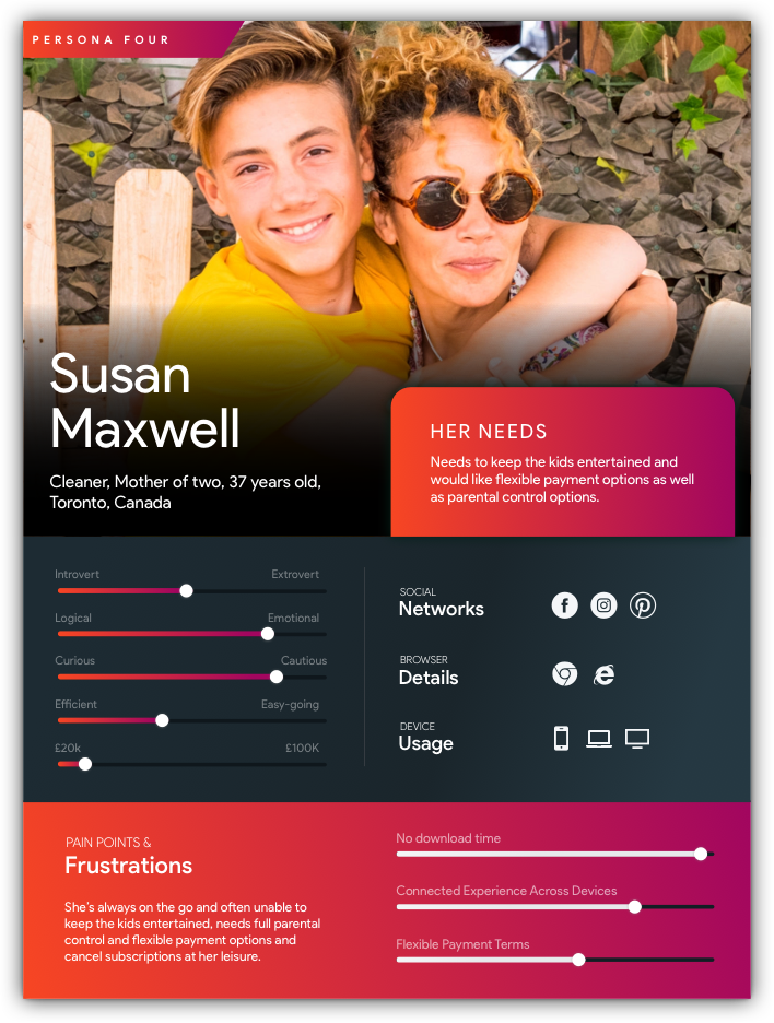
Personas
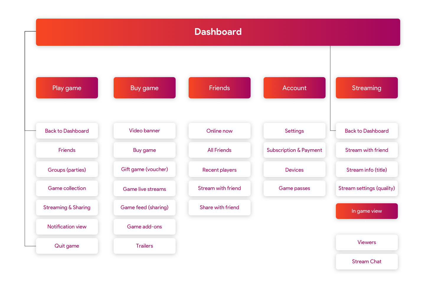
User-flows
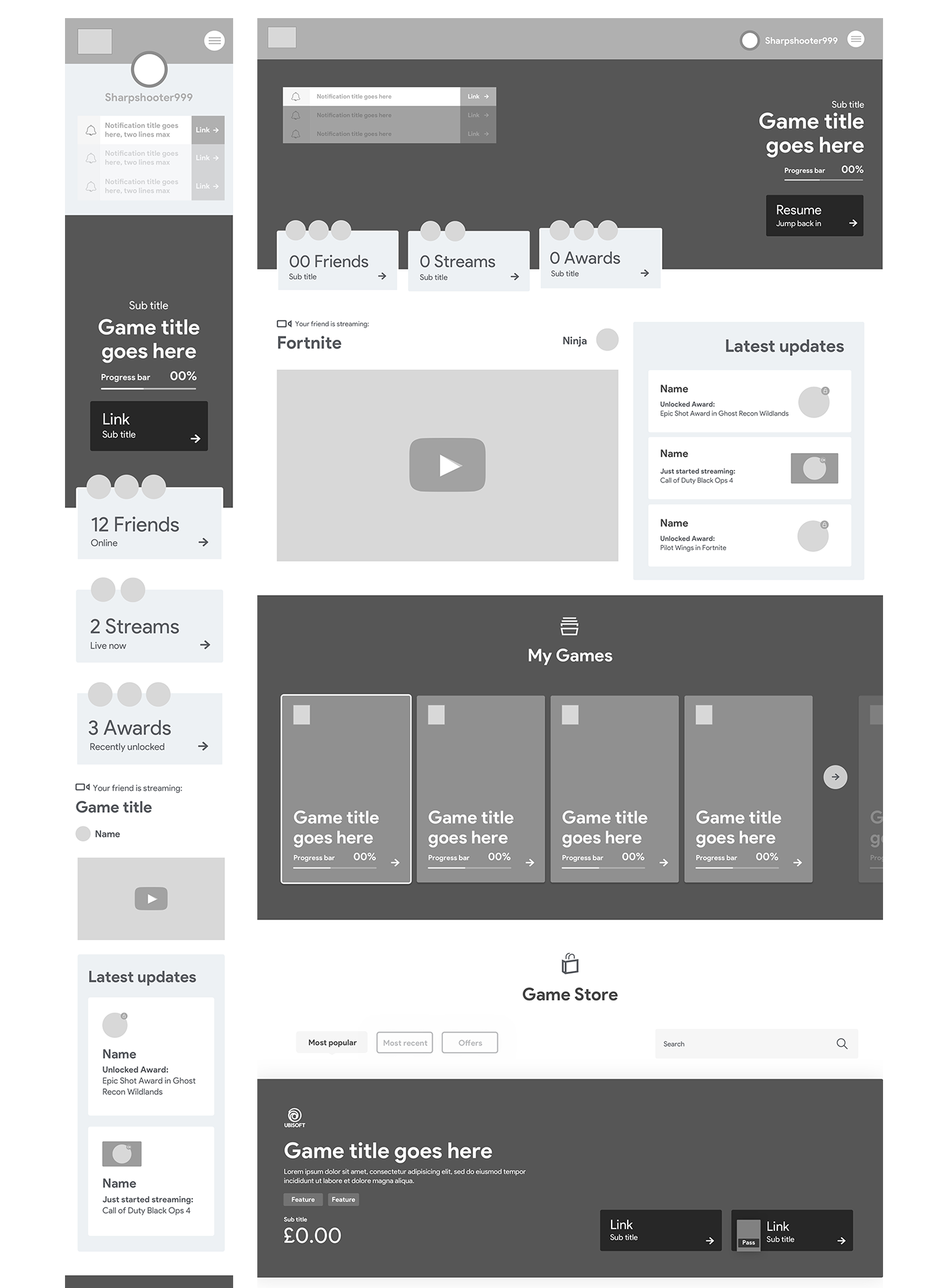
Wireframes
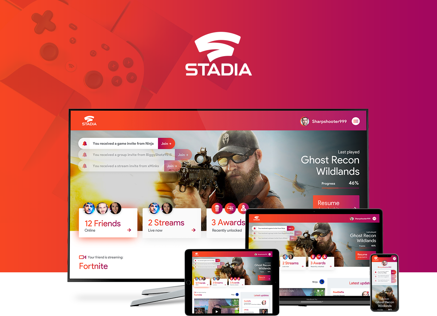
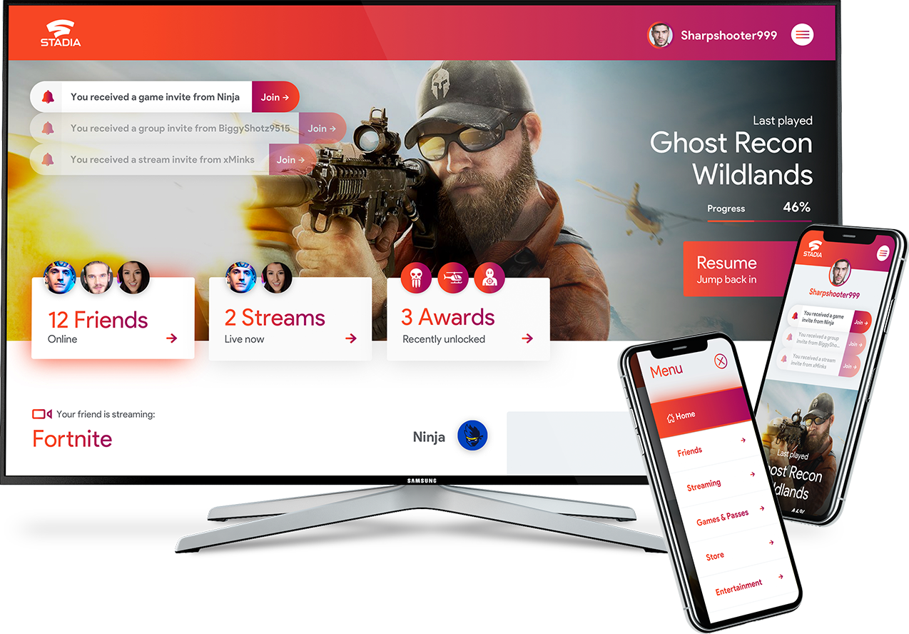
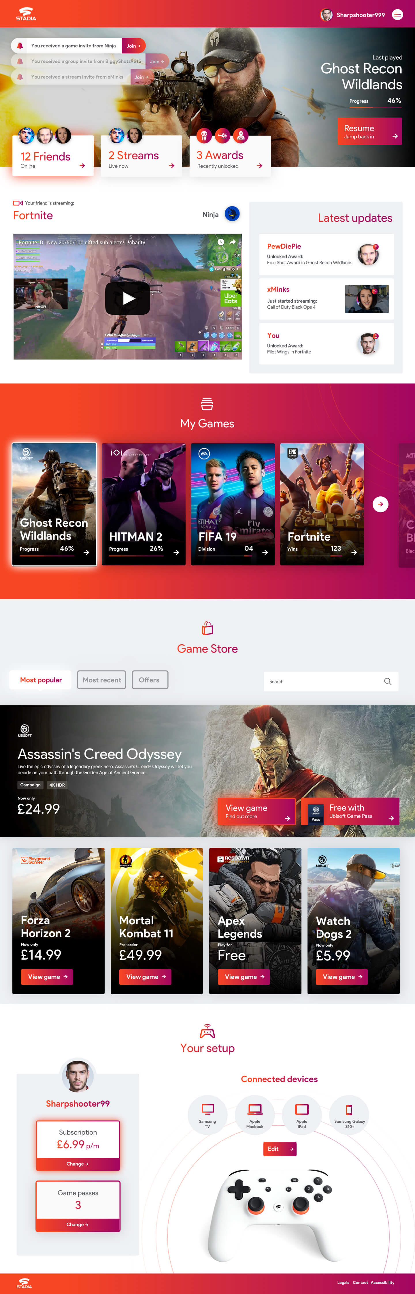
To understand what the general layout might look like I started with the dashboard design, as this would be the primary page users would navigate from it set the baseline for all other layouts. This was one of the most important pages to define the content that might be specific to Stadia that would need to be included like dynamic streaming content and sharing features, as well as some game other subscription model considerations.
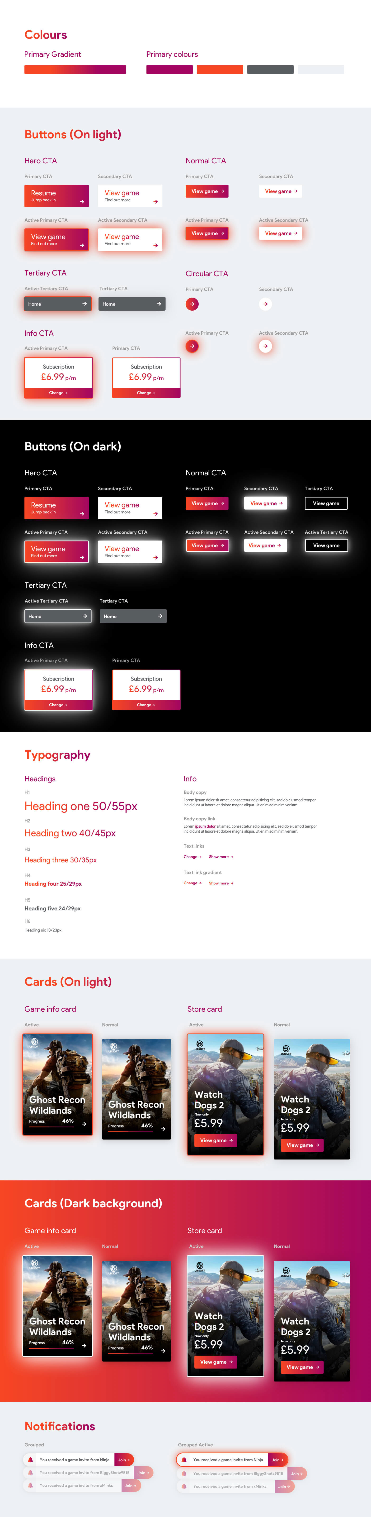
Pattern Library
When creating the UI patterns it was very important to define the active states of buttons and interactive elements, due to the input being primarily through a controller the UI of each navigation element needed to react as the user moved through the page. This is a slightly different UX approach to the usual point/click with a mouse or tapping on a mobile device.
Dashboard
For the dashboard I focused on large imagery as well as clear CTA buttons, driving users to navigate to play games or social interactions is key for this page.
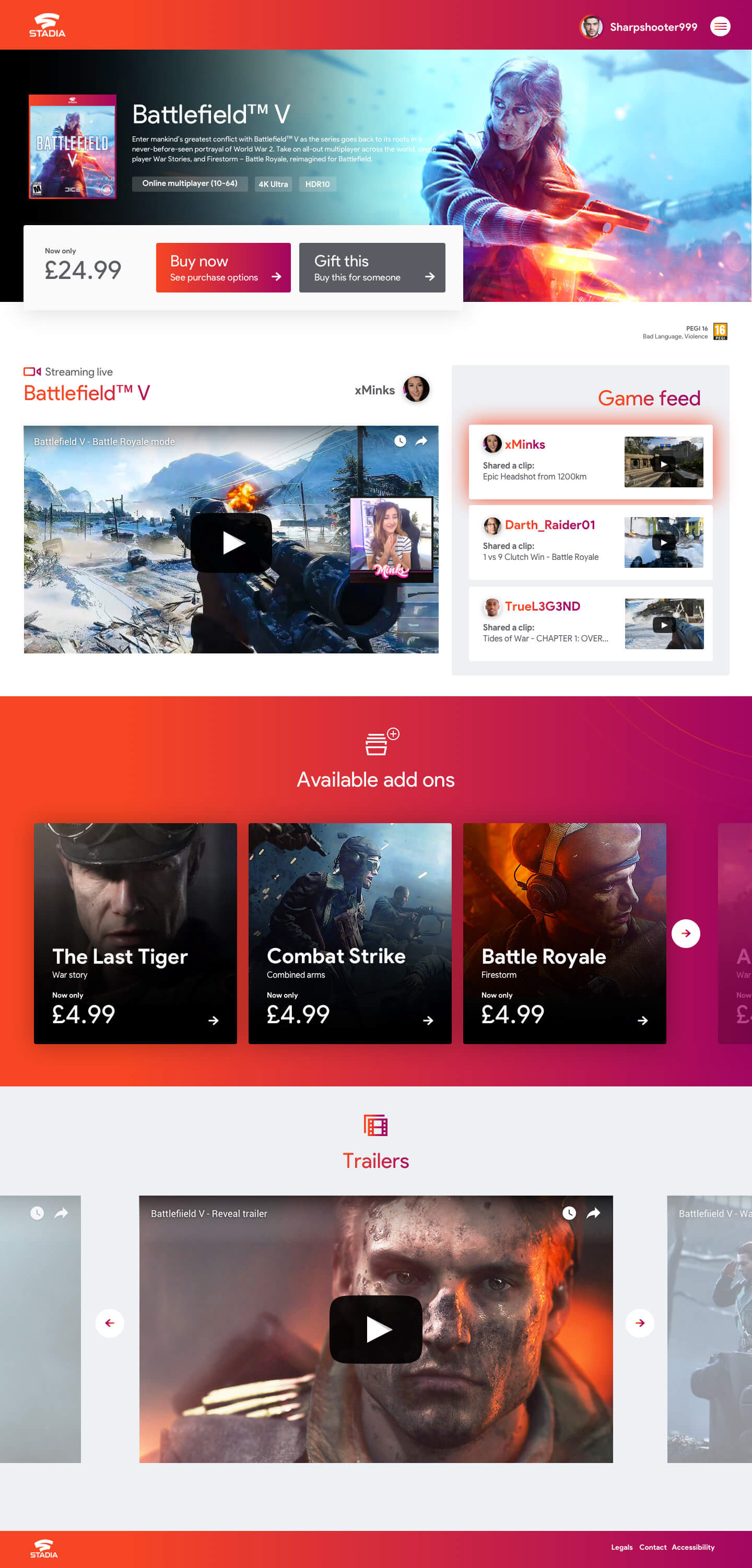
Game landing page
Each game in the store has it’s own page, the aim of this page is to showcase the game in the best way possible. Using video banners and other elements like live streams the game can be shown in all it’s glory, removing the use of static imagery bringing more life to the page.
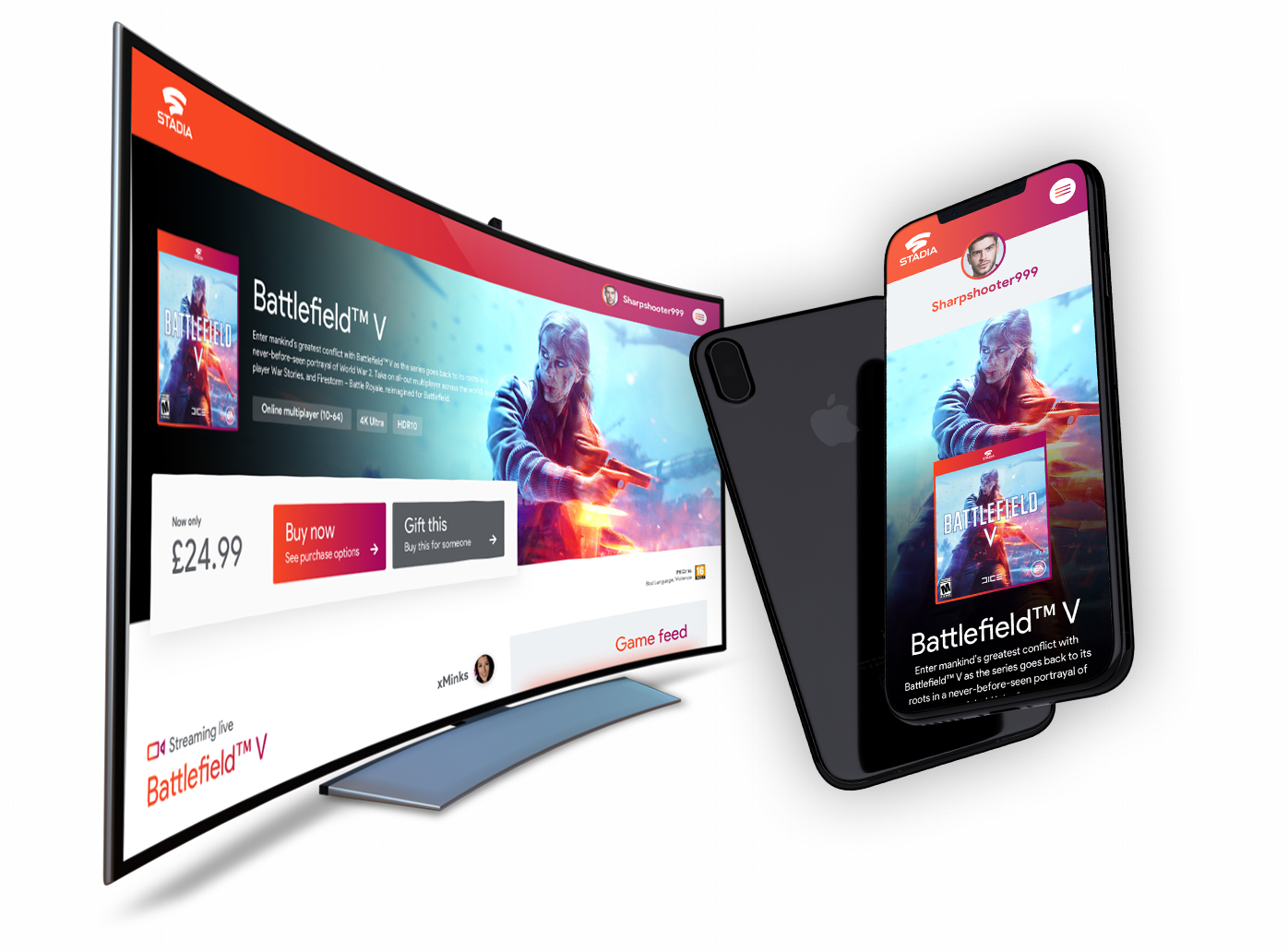
Video banner
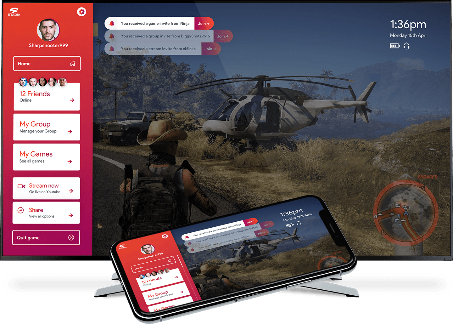
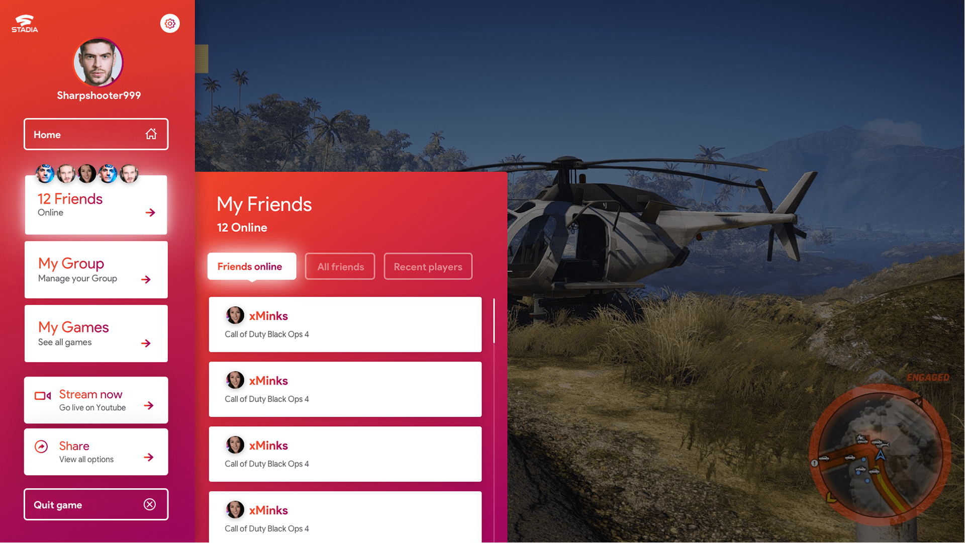
In-game Menu
When the user is in game it’s important they have a quick way to access all of their notifications, friends sharing and streaming options without needing to go back to the dashboard. I created a flexible navigation system that can work across all device sizes.